
6 PROJECTS
DESKTOP | MOBILE
W4M.AI
Year
2024 - 2025
TL;DR: Managed a 100+ component design system and audited 20+ PostHog issues to identify friction. Built high-fidelity, dense, enterprise flows to replace fragmented legacy architecture.
Scope
UI/UX Design
Design Systems
Information Architecture
User Research
Tools
Figma, PostHog, UXPilot, Adobe CC, Notion, Canva, Google Suite
Duration
1 year
100+ enterprise flows
100+ components & variables
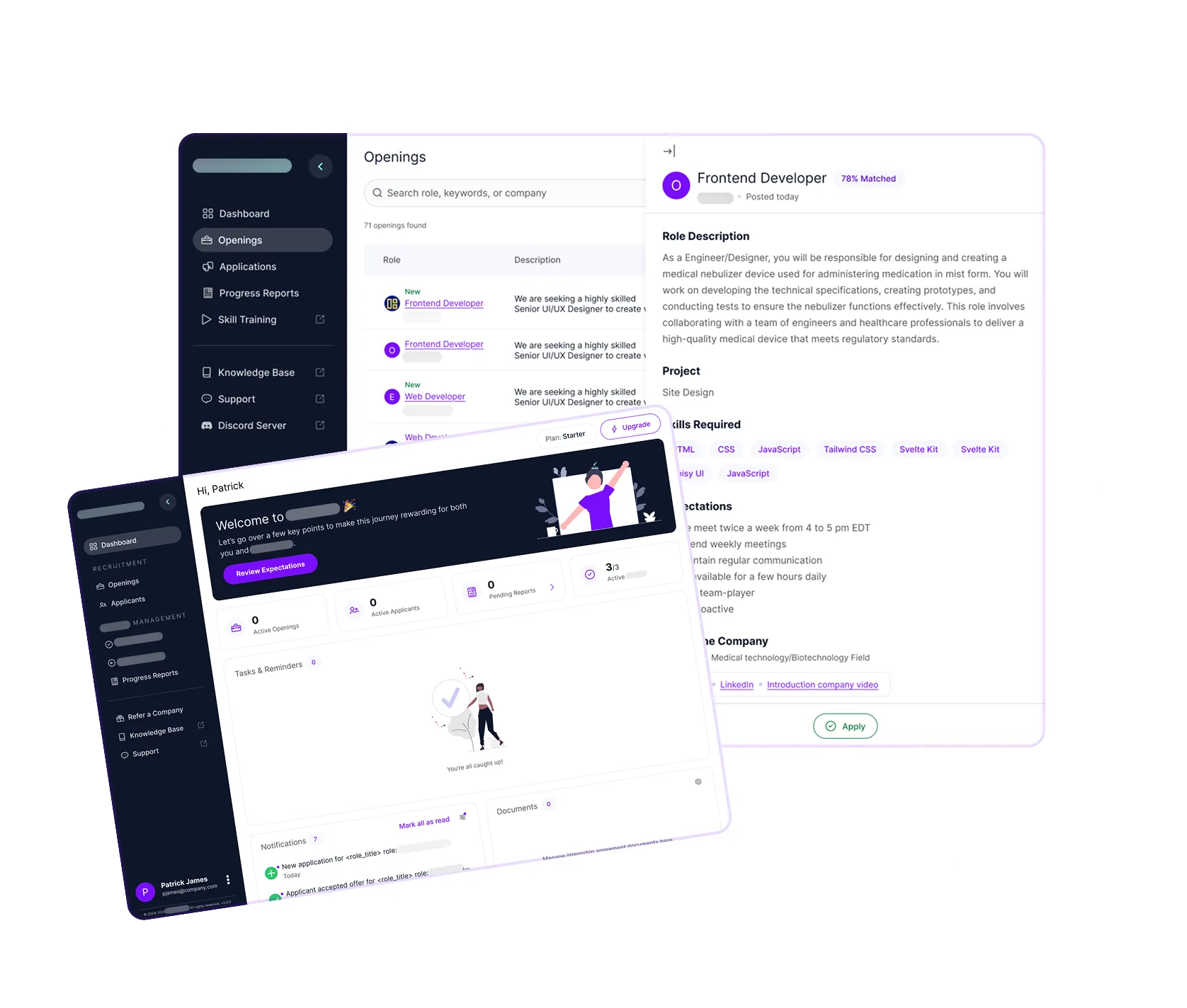
Overview
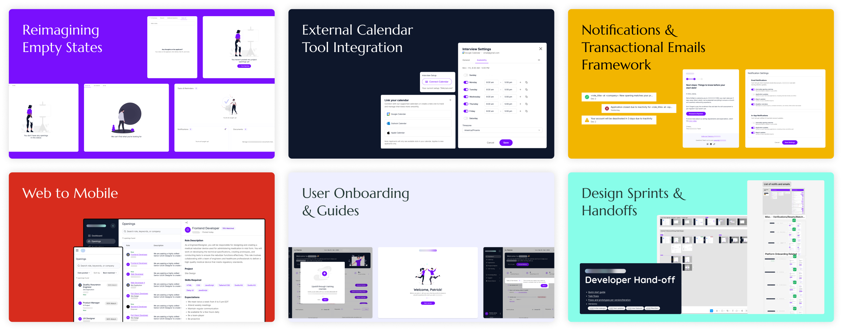
One Year. Six Initiatives.
I cross-collaborated with engineers, product managers, customer success teams, researchers, and the founders themselves to set up internal processes and deliver highly impactful solutions.
Note: I've left out the product's name and blurred visuals since the work is under NDA.
~98%
positive sentiment with the redesigned onboarding flow
95%
increase in discoverability and clicks on plan upgrade links from ~5%
60%
increase in discoverability and adoption of core table features from ~10%
Challenges
- I was tasked with solving a dual problem: driving product growth while managing design and usability debt (40+ issues).
- The product lacked consistency and branding, and suffered from poor information architecture.
Role
UI/UX Design Lead
& Visual System Owner
I also set design processes and eased the team into a design-first process. My goal was to establish a high-leverage design system and strategic UX flows that enabled faster and more intuitive processes.
I worked on a couple of key initiatives over the span of a year, including:
Led the end-to-end redesign of 2 user portals — streamlined critical workflows (sign up, onboarding, offboarding, etc.) and shipped 100+ user flows.
Conducted 20+ user interviews and usability tests for drafting personas, validating new features, and led heuristic evaluations to establish the problem scope.
Designed and launched 3 marketing websites, a brand guidelines document, rebranded social media graphics, and branded physical materials and product prototypes.
Re-wrote 50+ email templates, 80+ user resource articles, pitch decks, one-pagers, and all in-platform language (e.g., confirmation screens, tooltips).
Created a 100+ component design system utilizing existing libraries. Implemented a master file with all user flows to ensure integration with existing dev-focused processes.
Implemented cross-functional handoff, audit, and testing processes. Mentored 2 designers. Created Slack automations and standardized social media design team's workflow.
My Weekly Routine
The tight, resource-limited environment forced me to practice ruthless scoping, dedicating deep work sessions to high-impact features, while using the remaining time for essential collaboration and process maintenance.- Monday - Wednesday & Friday: 4-6 hours on high-priority tasks and the remaining for ad-hoc meetings and updates.
- Thursdays: Reviewed PostHog data (heatmaps, funnels, recordings, etc.) and support tickets to analyze user behavior and identify high-priority usability issues and bugs.
Empathize & Define
Diagnosing the
System-Level Friction
Heuristic evaluations (Jakob Nielsen’s 10 rules) were my bread and butter for identifying the critical usability issues in the existing system. Here are some of the key issues identified:
- Low conversion & hidden revenue paths: The onboarding path was dense, and the payment portal was inaccessible within the app, negatively impacting the user experience.
- Engagement debt & fragmented data: Critical table-based workflows lacked familiar search and filter patterns, and dense data was displayed on fragmented modals or pages, breaking user flow and mental models.
- Trust & CX gap: The platform's overly technical and inconsistent use of language created a confusing, high-friction experience.
Design Operations
Advocating for Design Accuracy
My role here went beyond design — I was tackling process and collaboration issues from day 1. The startup environment lacked formalized QA and handoff protocols, which meant constant UI drift. I ended up integrating design QA directly into the product development lifecycle, treating UI debt as a critical business problem.
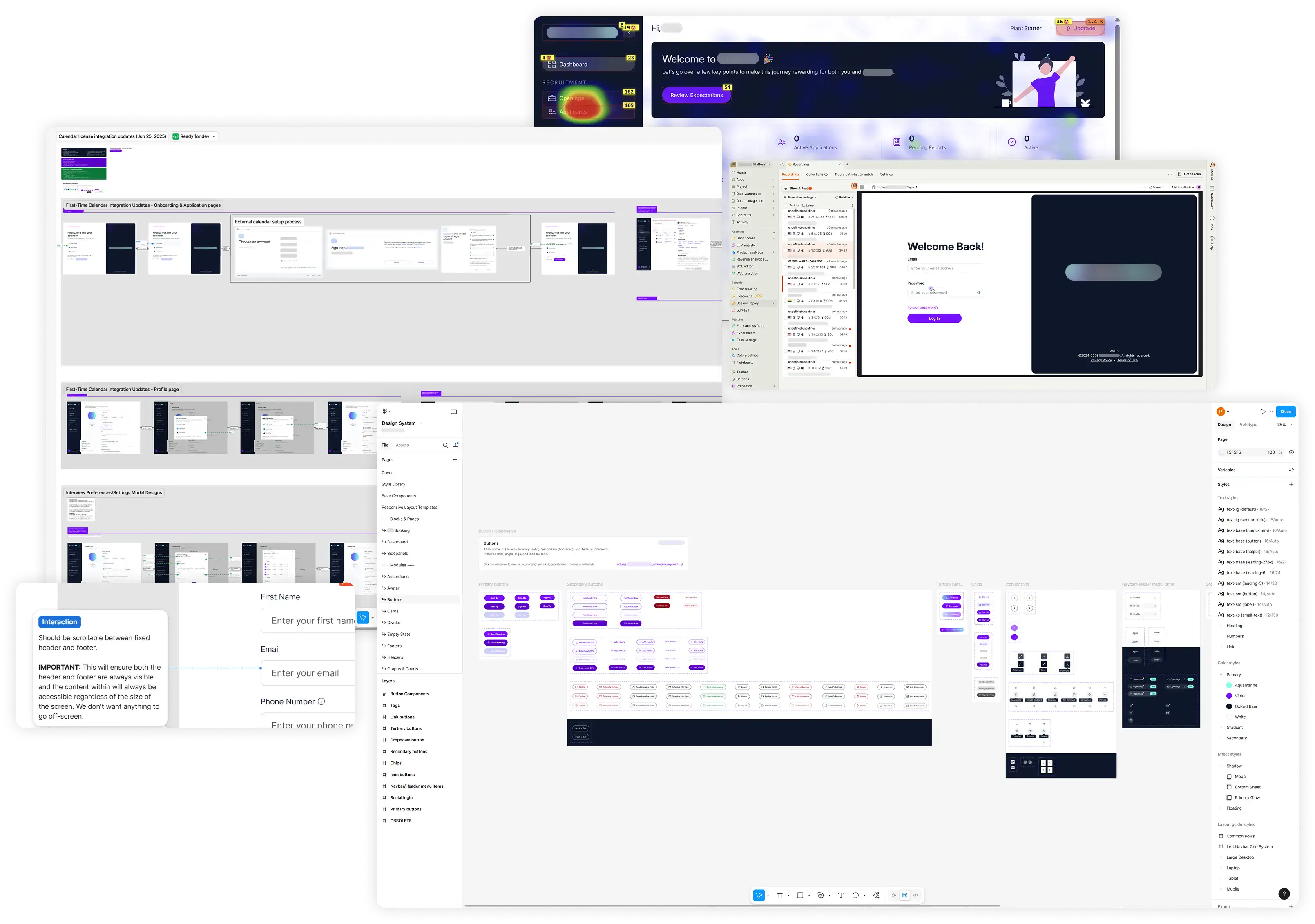
- Live UI failed to match Figma specifications on multiple instances.
- Inconsistencies were caught late, leading to technical debt across a large, fragmented product.
- Subtle UX issues in support tickets were missed, creating an unchecked backlog that needed to be addressed.
- Established a rigorous QA system; video walkthroughs, Figma MCP, and mandatory review calls to check builds against Figma.
- Took up a monthly audit of the live app to proactively catch release inconsistencies.
- Started weekly analysis of tickets and metrics in PostHog to identify UX issues and follow up.
- Eliminated recurring UI inconsistencies over a few weeks, reducing development rework.
- A scalable process for maintaining UI quality across 100+ flows.
- A tighter feedback loop, ensuring critical issues were addressed within two weeks rather than months.
Strategize & Design
Solving for Scalable Usability
My strategy focused on using data to drive design decisions, integrating design thinking into an engineering-heavy environment, and delivering maximum business impact with minimal resources.
1. Conversion Optimization & Revenue Clarity
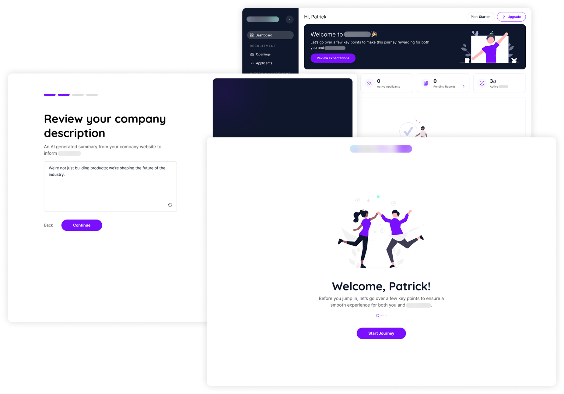
- The dense onboarding process made 75% of the users feel overwhelmed.
- Founders were wasting time conveying platform expectations repeatedly to potential users on calls.
- The main payment portal was inaccessible (discoverability ≈5%) in-app.
- Simplified into a multi-step structured flow to reduce cognitive load.
- Added these guidelines to the sign-up flow as informational content, using simple language and illustrations for immersion.
- Added a button directly to the app dashboard for quick access.
- 97.8% positive sentiment for the new flow.
- 60% reduction of instructions over potential sign-up calls.
- 95% increase in discoverability and 100% click-throughs per paid user on upgrade links.
2. Data Unification & Engagement
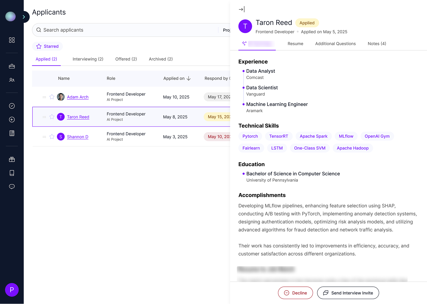
- Fragmented workflows broke user mental models by navigating to separate pages for flows within the same pipeline.
- Table data displayed in individual modals for every cell was complicating a simple view details workflow.
- Global search/filter tools were hidden and so highly customizable that it was difficult for regular users to find and use them efficiently.
- Replaced with status-based tabs on a single page, maintaining user context within the pipeline.
- Introduced a side panel that slides out on row click to display all associated data in a single go instead.
- Implemented familiar search bars and filter dropdowns at the global page level to improve discoverability.
- 100% user acceptance in testing for both the new status tabs and side panel designs.
- 60% increase in the usage of search/filter features, leading to 100% adoption on all 5 key pages.
3. Closing the Trust & CX Gap
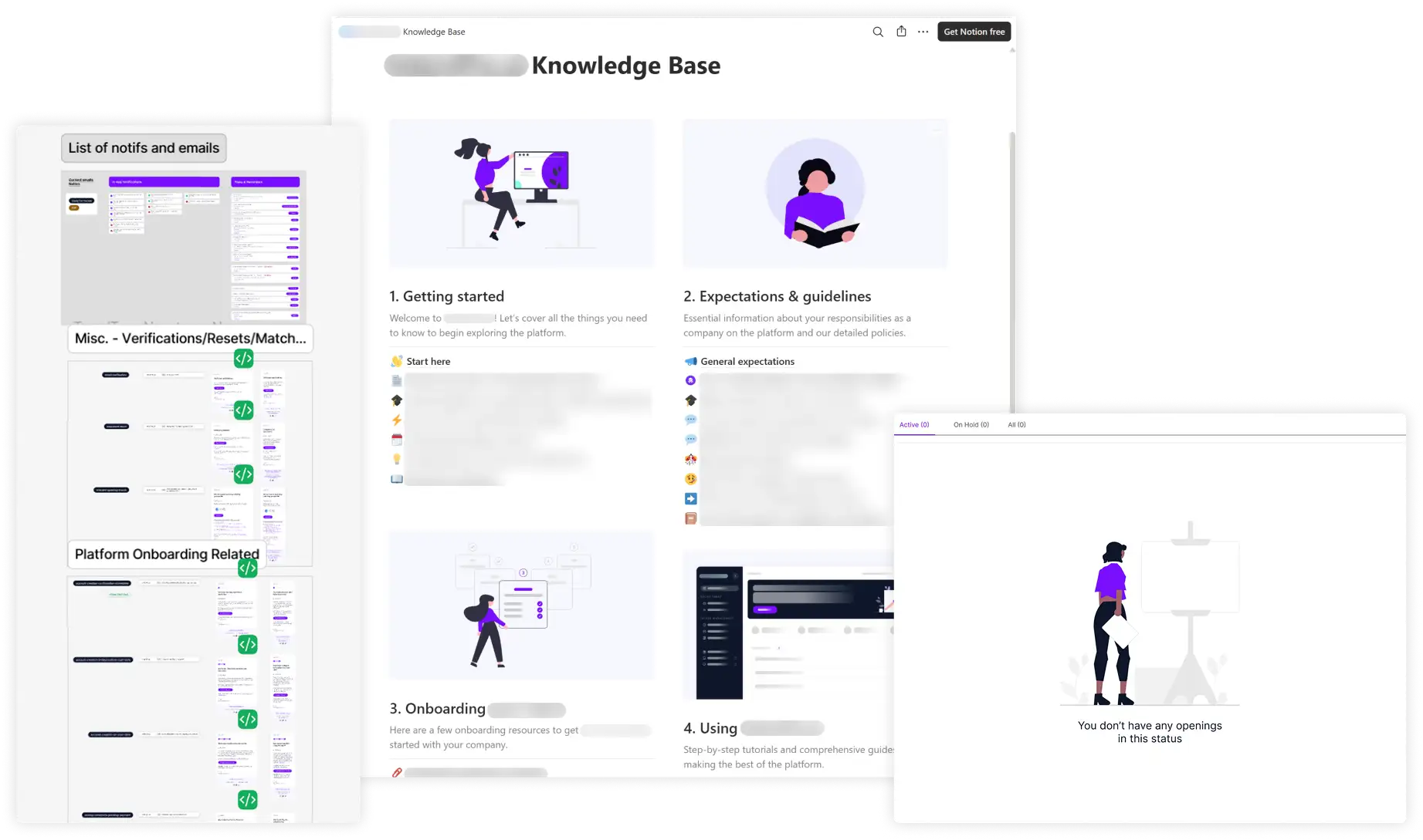
- Communication (email, in-app) used overly technical language and had an inconsistent voice.
- The user resource hub was a 3rd party integration, limiting customization and visibility of nested articles our users required.
- Led the overhaul of 50+ emails and communications to a conversational brand voice.
- Led platform migration and complete resources revamp (80+ articles), linking support articles directly in-app based on context.
- Users now had more intuitive empty states and a trustworthy, consistent voice across the product.
- The new Notion hub provided way more control, and nested articles were now up front and directly accessible from in-app elements.
Visual Strategy
The 60-30-10 Magic
Neutral white was used for backgrounds (60%), primary violet for CTAs (30%), and gradient for notifications (10%). This ensured the data-dense interface remained neat, clean, minimal, and professional, using a high degree of whitespace to aid user focus.
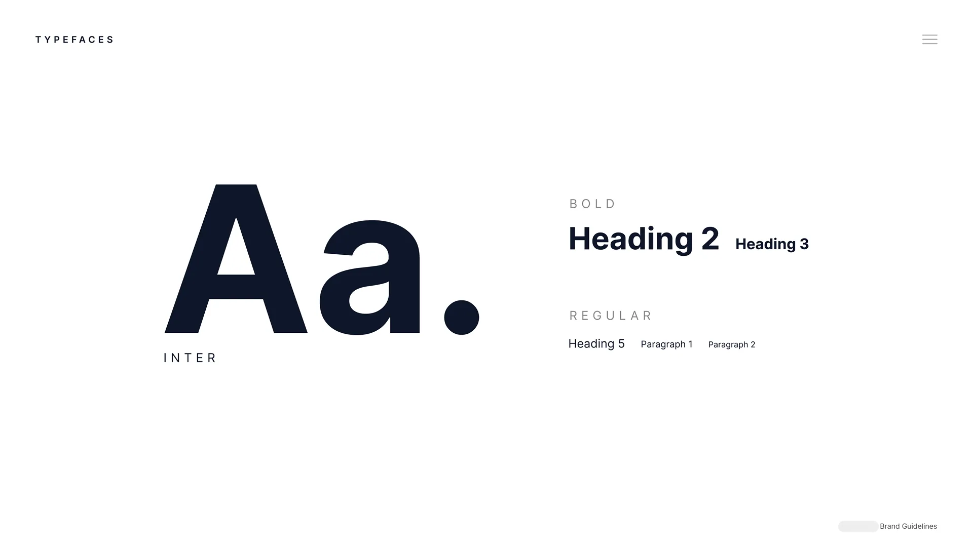
Font usage: Inter font instead of the brand font for better legibility and neutrality in data-dense interfaces.
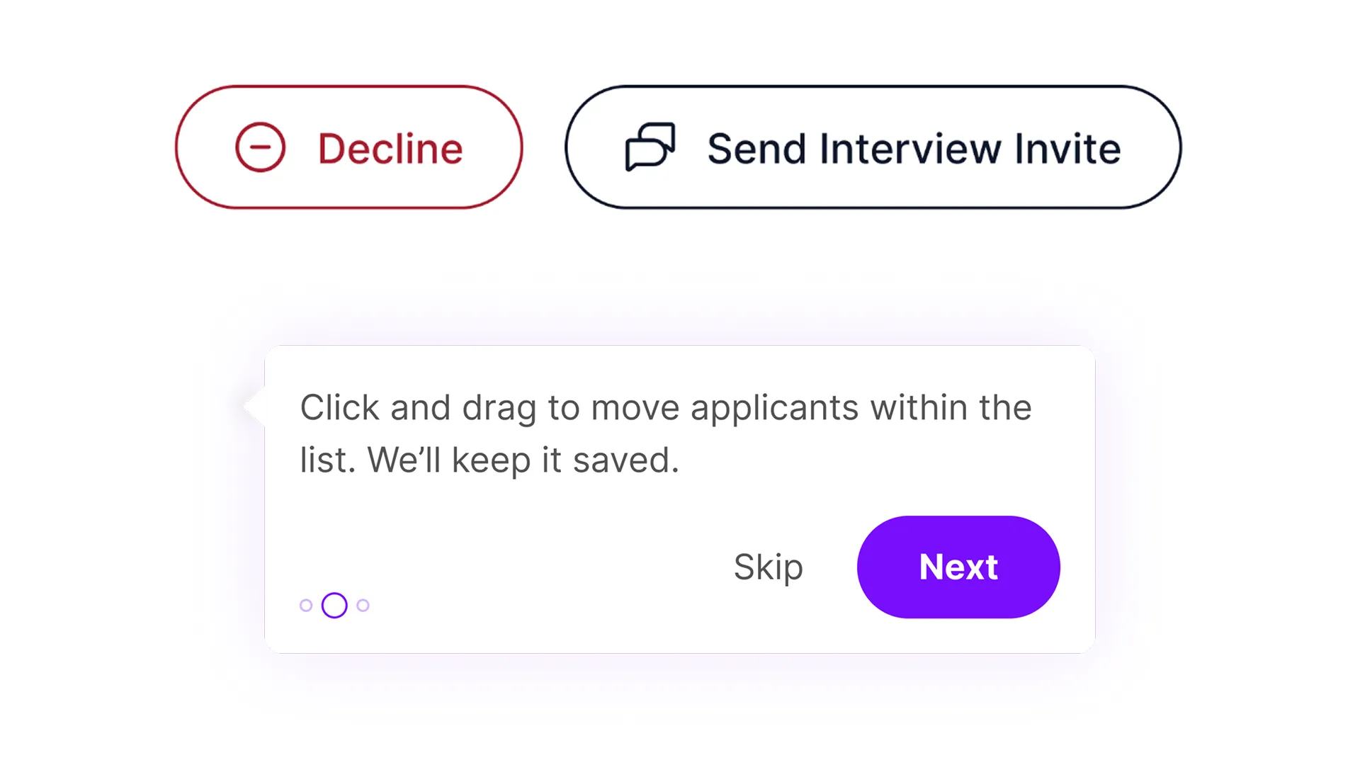
Casing: Title for CTAs and sentence for the rest of the text to ensure consistency and readability across the brand.

Primary color variants: 4 for backgrounds, interactions, illustrations, and social media to create visual cohesion.
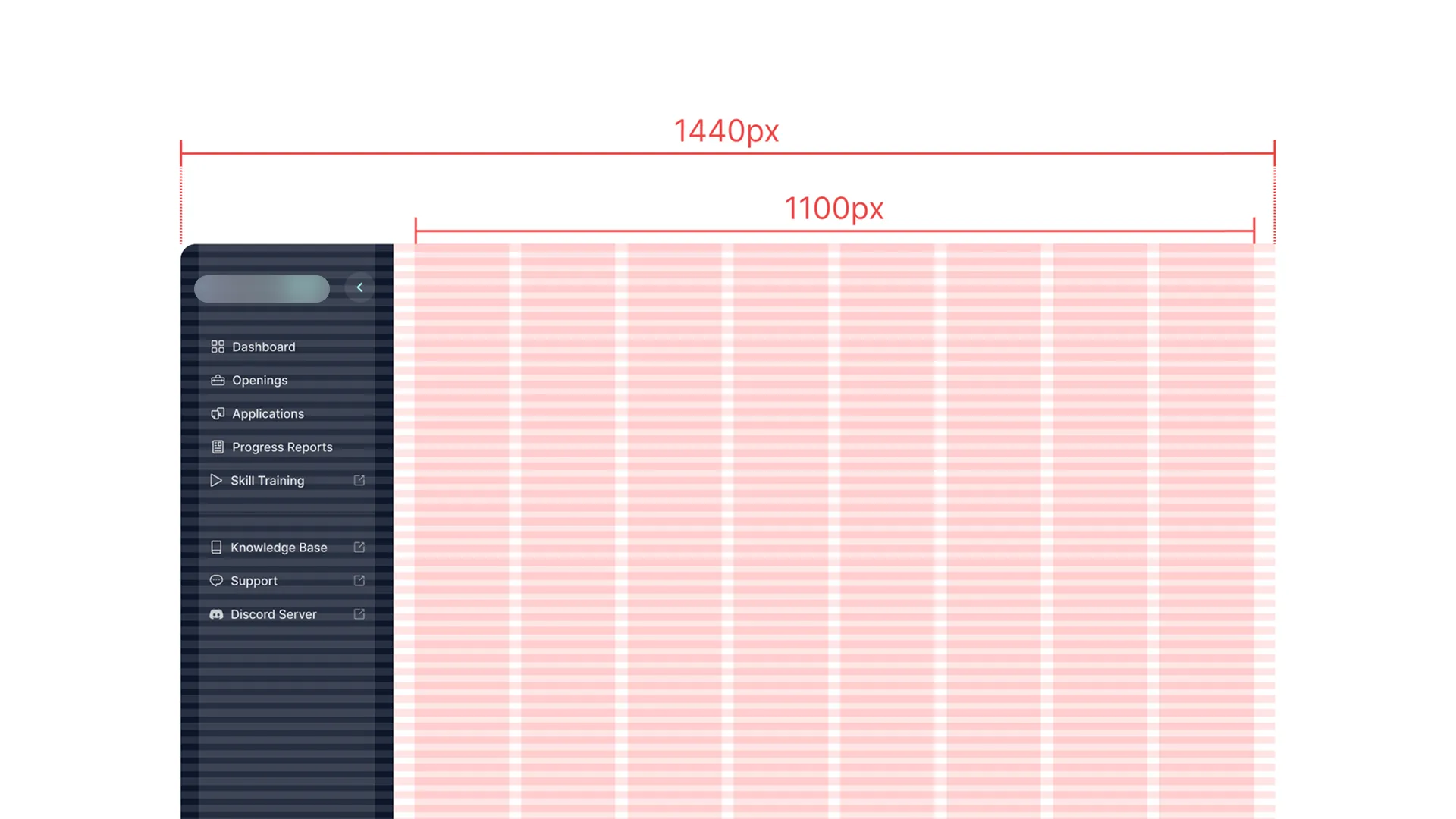
Layout prioritization: Designed first for 1,440px (96% desktop users) and then moved to mobile (min. 320px).
Principles & Strategies Used
Jakob's law's application: Designed new search bars, filters, and dashboards using familiar B2B SaaS patterns to ensure instant user comfort and predictability.
Fitts' law & visual prioritization: Applied primary brand color only to the most critical element (Upgrade/Create CTAs) on core pages, resulting in a 100% click-through rate from the visual focus.
Customization strategy: Leveraged existing libraries (Flowbite/Tailwind) for components to save time, and customized only complex components (charts, panels) for unique functionality.
Formatting for Dense Tables
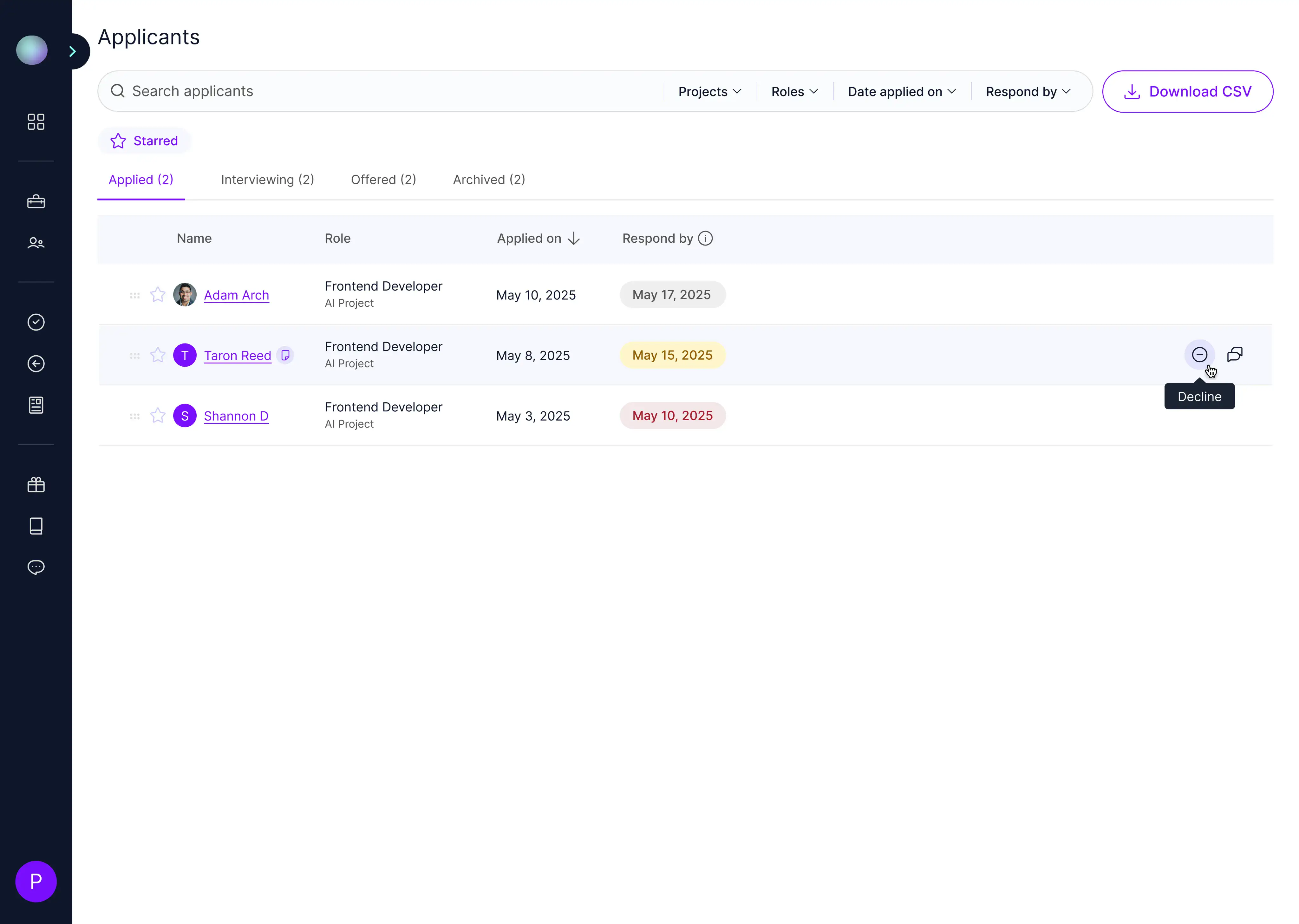
Dates changed to "December 1, 2025" for better scannability, status tags color-coded (semantic colors) consistently, and row actions nested in hover interactions to reduce visual clutter.
Dates changed from "12/1/2025" to "December 1, 2025" for better scannability
Status tags color-coded (semantic colors) consistently
Row actions nested in hover interactions to reduce visual clutter
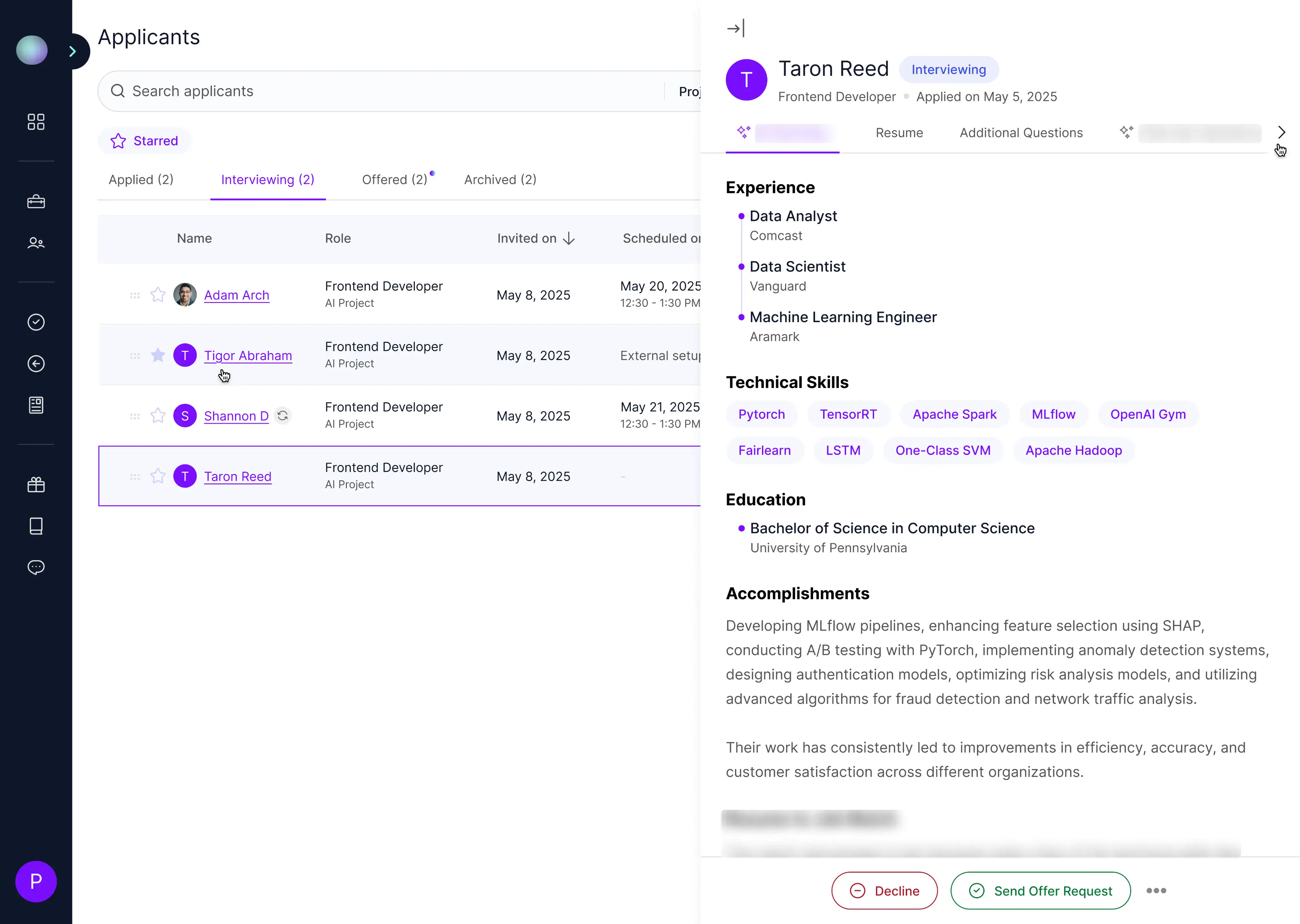
Enhancing UX with Tiny Side Panel Interactions
Users can interact with the entire page, even with the panels open. Clicking a new row replaces side panel content automatically, supporting fast workflows, and a next indicator shows users when side panel tabs overflow, increasing user trust.
Users can interact with the entire page, even with this panel open
Clicking a new row replaces side panel content automatically, supporting fast workflows
A next indicator shows users when side panel tabs overflow, increasing user trust
Reflection
Solo Growth in a
Fast-Moving Startup
Leading the design function alone while simultaneously defining the process proved to be the ultimate test of strategic prioritization for me:
- Handoff is a strategic deliverable: The quality of the handoff — including annotated prototypes, embedded dev tickets, and video walkthroughs — is paramount. Treating it as a product itself maximized developer velocity and reduced implementation errors.
- Balancing velocity and fidelity: I adopted the 70-30 rule, dedicating 70% of my time to high-impact growth features and 30% to design system maintenance and ad-hoc tasks. This was essential for shipping 100+ features while managing brand integrity.
- Data as the design partner: The rigorous use of PostHog funnels, heatmaps, and user recordings wasn't just for validation — it was the foundation for prioritization, allowing me to close the feedback loop on 20+ usability issues quickly.
- AI as a force multiplier: I integrated Gemini for consistent tone in copy and UXPilot/Figma Make for rapid wireframing and prototyping. We also used Figma MCP to assist in coding the designs. These integrations allowed me to reduce my iteration time by 20%, freeing up capacity for strategic design and collaboration.