
TEAM PROJECT
MOBILE
ASU ESEED CHALLENGE WINNER
NurseWav
Year
2023
TL;DR: Translated clinical research data into a tiered alert system and dashboard to reduce cognitive load for nurses. Focused on alert prioritization to ensure accuracy in high-stress hospital settings.
Explore Interactive PrototypeScope
Product Design
UI/UX Design
Interaction Design
User Research
Tools
Figma, Google Suite, Qualtrics, Canva, Zoom, Airtable, Miro
Duration
3 months
10+ components
3 critical flows
Overview
Mitigating Patient Safety Risks
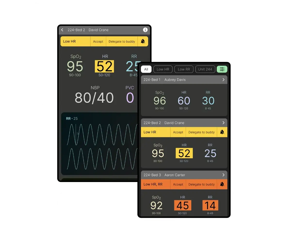
Jump to SolutionAlarm fatigue is an increase in a healthcare provider’s response time to an alarm as a result of experiencing excessive alarms, potentially risking patient safety. These alarms go off when, say, a patient's heart rate is lower than normal.
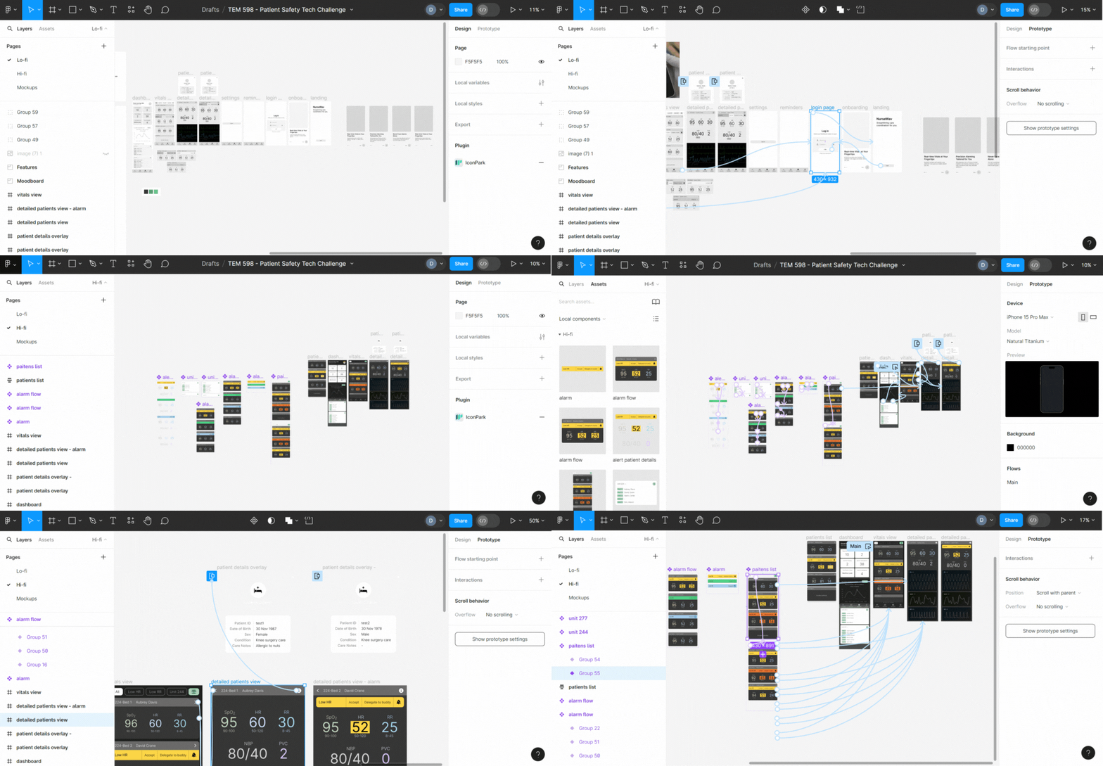
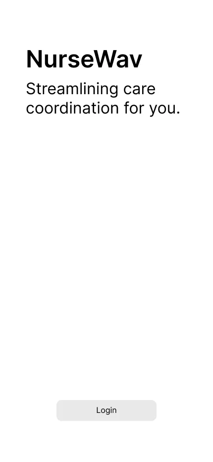
NurseWav is a one-of-its-kind mobile app built to help nurses tackle alarm fatigue in hospitals by moderating and organizing the influx of excessive alarms. This three-month project was a research-heavy, cross-functional effort with 4 others as part of the Patient Safety Technology Challenge, winning the pitch to Arizona State University’s eSeed Challenge for funding.
The work involved a two-month strategic research deep dive followed by a month of solution ideation. As part of the challenge, we researched existing issues in the medical field under the guidance of our mentor, Ariana Longley, a patient safety expert, and chose to solve alarm fatigue based on the results and our personal experiences.
Challenges
- High volumes of non-actionable false alarms lead to excessive, unnecessary bedside trips for nurses.
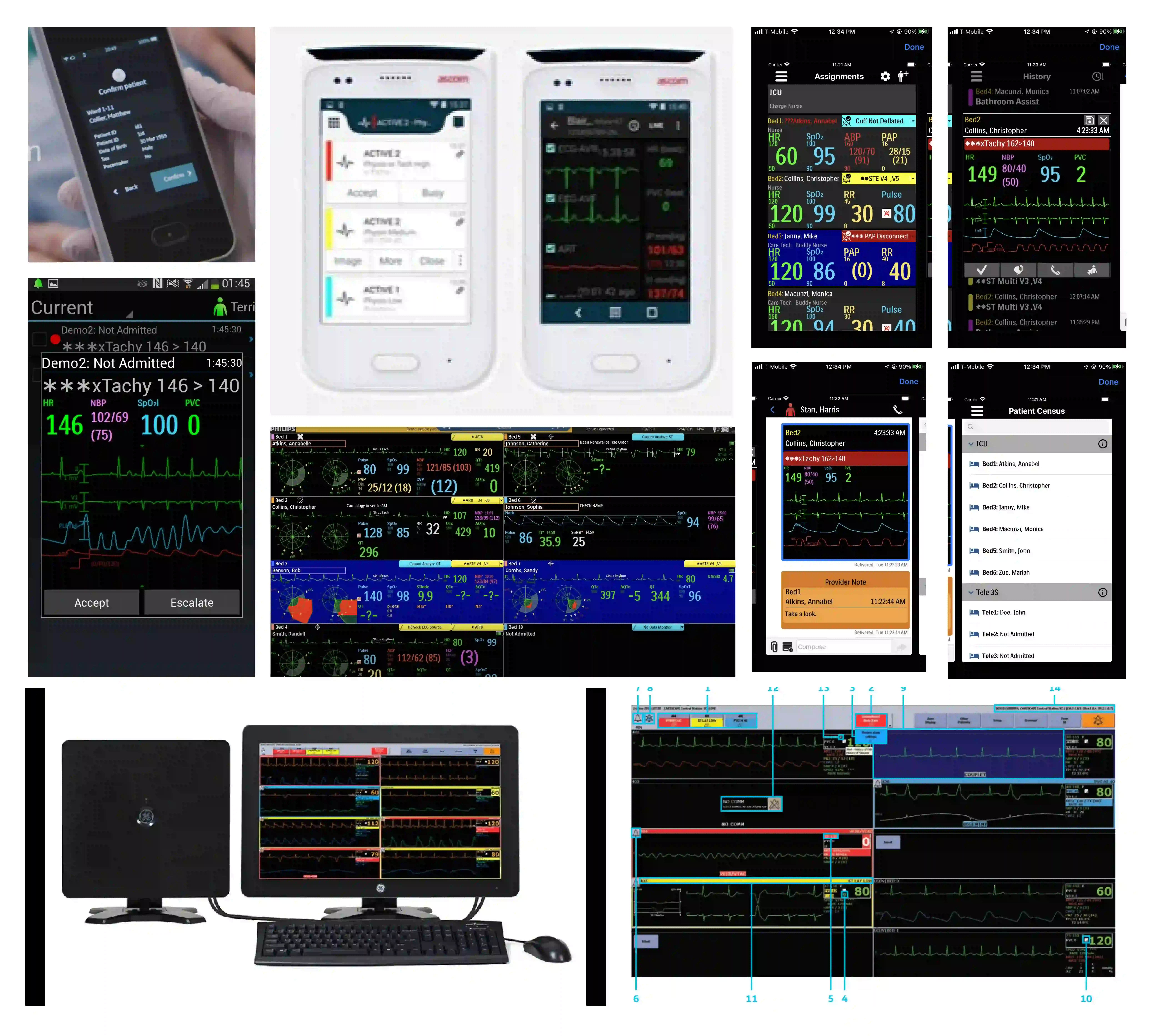
- Existing solutions have complex/cluttered interfaces and face challenges integrating with existing hospital systems.
Goals
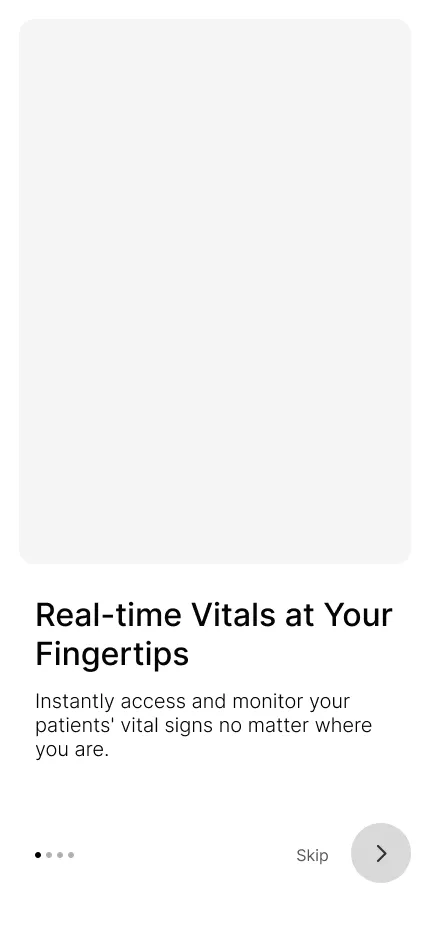
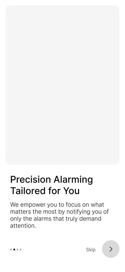
- Filter and prioritize alarms to ensure nurses only attend to actionable events, reducing physical strain and noise.
- Ensure the solution seamlessly integrates with existing hospital systems.
Role
Product Design Lead
My responsibilities included leading the branding strategy for market viability (pitch deck) and driving the high-fidelity prototype design in Figma. It also included defining the user personas and patient safety workflows, and documenting the core solution architecture with the team.
Design Process
From Research Deep Dive
to Prototype
- Conducting research by sending out user surveys and performing user interviews.
- Ideating the solution — figure out a foolproof alarm management flow.
- Designing wireframes.
- Designing a high-fidelity interactive prototype.
Empathize
Understanding Alarm Fatigue
Our research unfolded in two stages — the first phase was researching the broader problem area. We began by addressing questions like which problem category we want to tackle: Diagnostic errors? Infections? Surgery-related issues? And so on. We read several research papers and articles on the internet, discussed our personal experiences, brainstormed with our mentors, and chose to address alarm fatigue as a result.
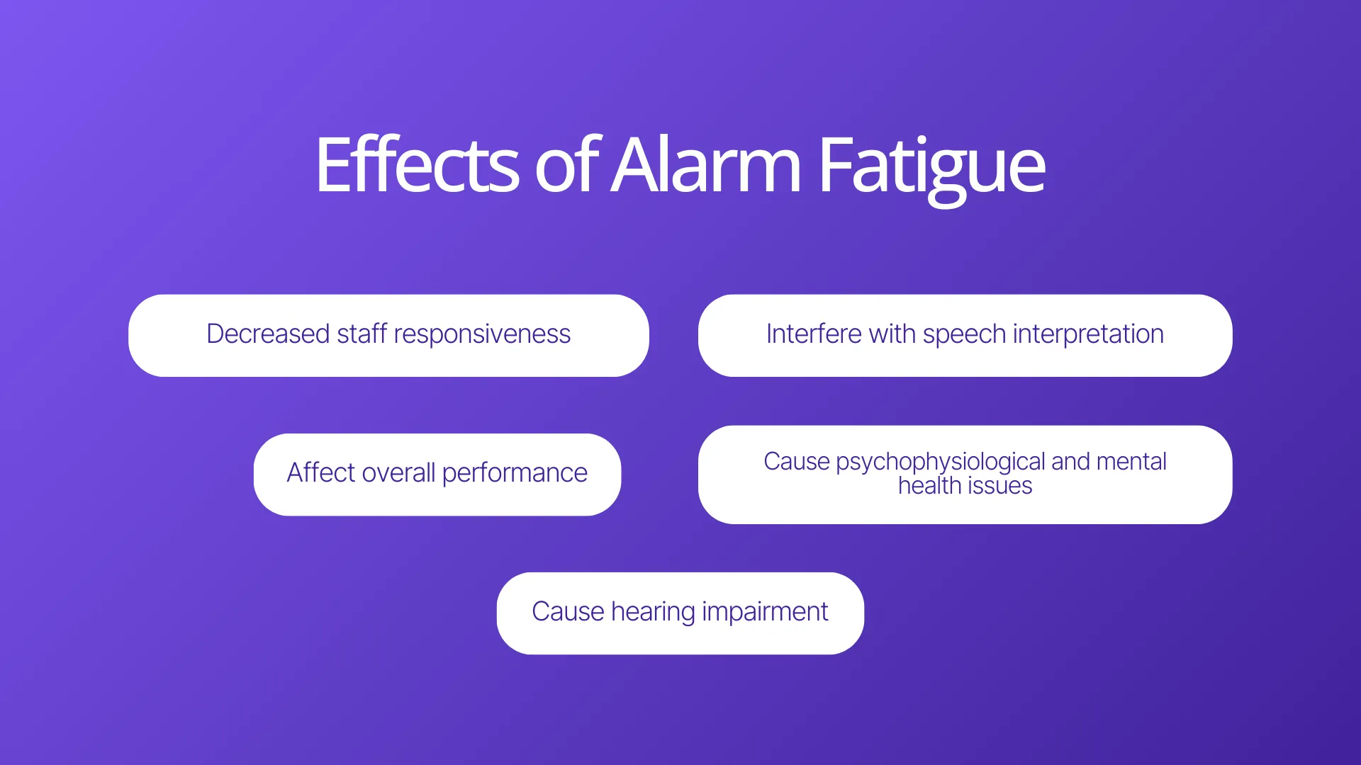
85-99% alarms are false or clinically insignificant: the highest-ranked issue by the participants was the difficulty in distinguishing between false and true alarms, resulting in needless trips to patient's bedside.
We received 24 responses for the survey, with the majority of participants aged over 40, boasting a minimum of 20 years of experience in the medical field:
100%
familiarity with alarm fatigue’s concept
40+
alarms are encountered in a typical shift
90%+
report vital sign alarms are triggered the most often
42%
report alarm differentiation and customization as challenges
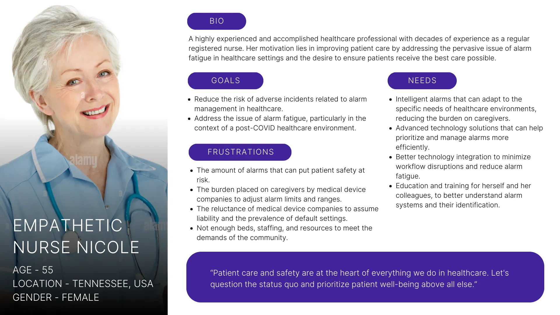
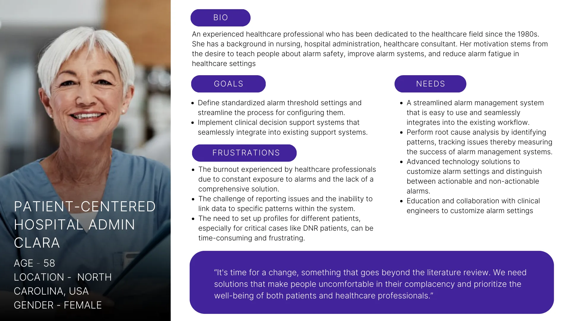
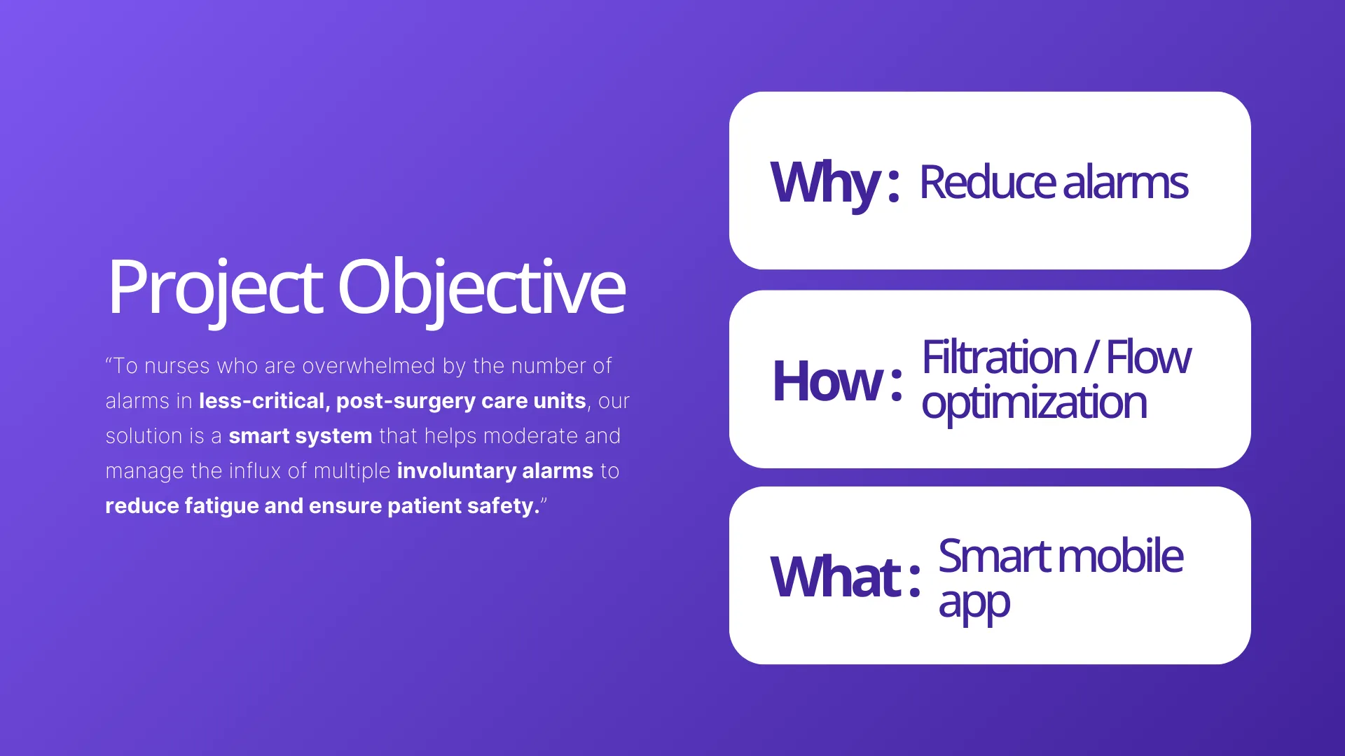
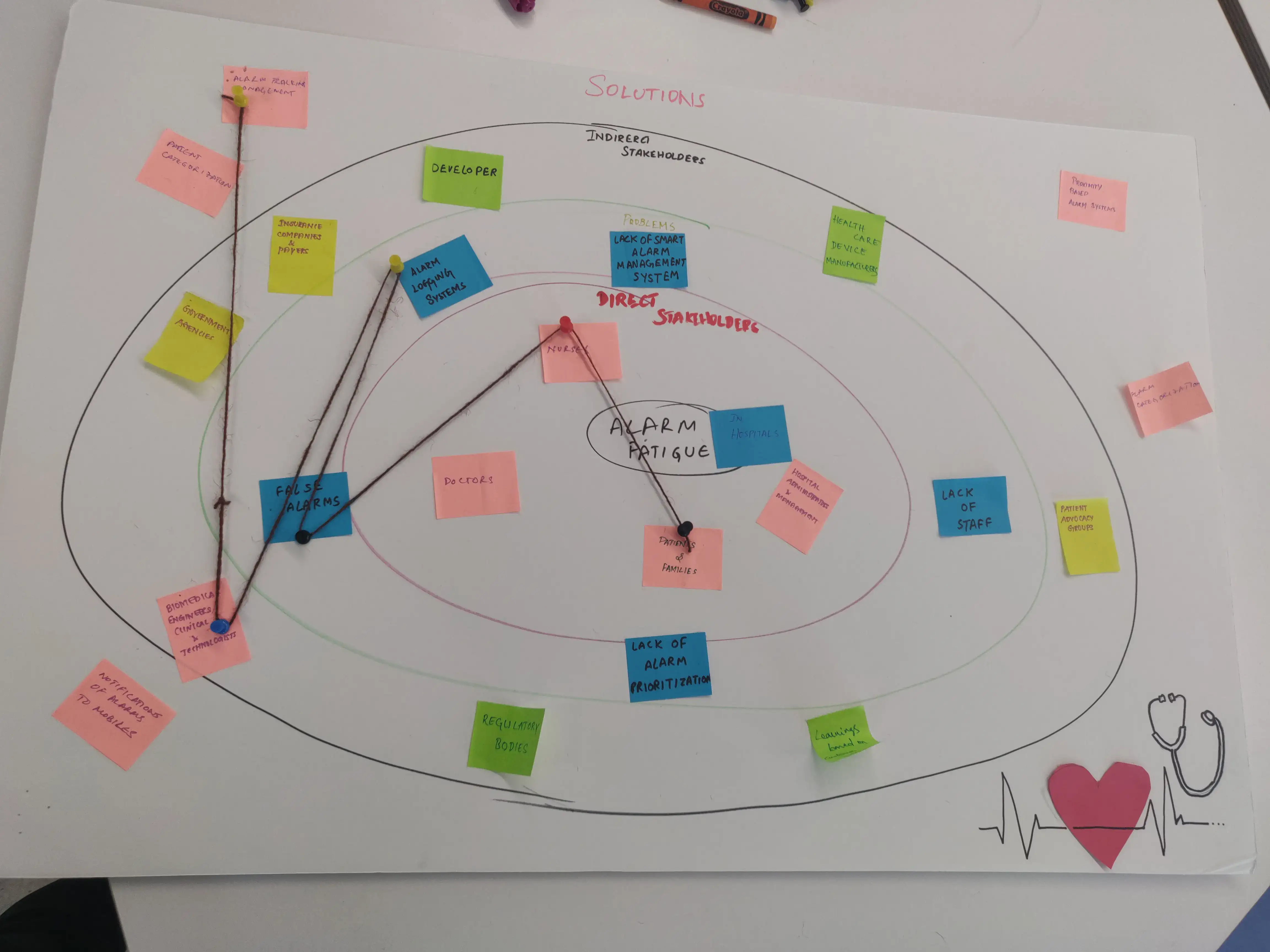
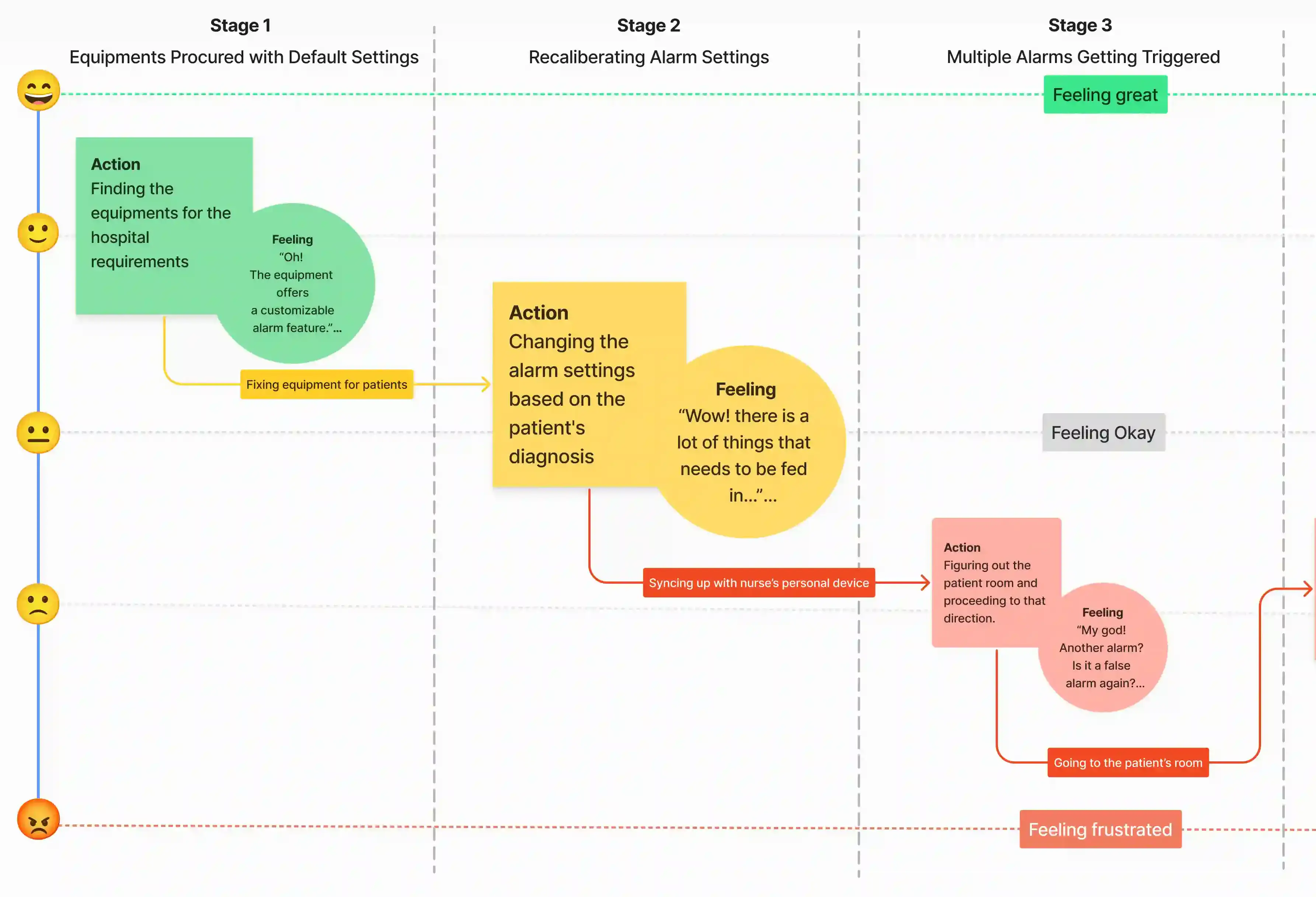 This research data resulted in us narrowing down our problem area a little more and giving us a more concise problem statement, i.e., we now started looking at solutions targeting nurses and involuntary alarms in less-critical post-surgery units.
Ideate
Defining a Precise,
High-Impact Solution Scope
Our solution was precisely scoped to address the highest-risk area: involuntary alarms in less-critical, post-surgery care units. The solution provides a mobile-based smart system to manage and moderate the influx of these alarms, directly targeting patient safety.
Exploring a physical solution
We initially explored a hardware-integrated bedside remote to manage voluntary alarms and secondary patient needs (e.g., TV controls). But research and stakeholder consultations revealed a major barrier to entry — massive manufacturing and hospital-wide installation costs, and a possible feature creep.
The pivot: Why a mobile app?
It's easier to integrate with existing hospital infrastructure since nurses already have hospital-provided mobile devices, making it simply a matter of installing an application on them. This form factor enables nurses to manage alarms remotely, drastically reducing unnecessary bedside trips while offering a level of personalization and filtering that a physical device couldn't support.
Following a rapid task analysis utilizing Nielsen’s ten heuristics, I moved into Figma to define the high-fidelity experience.
Design & Prototype
Designing for Criticality & Clarity
I kept in mind the nature of work and the physical environment of users throughout the stages and designed for clarity, accessibility, and eliciting quick reactions in critical situations.
This meant that any alerts/warnings showing up on screens needed to be visually distinct to draw attention immediately; only the most critical information should be shown on screens. Screens needed to be clean and clutter-free for increased focus, and should be easily navigable even in pressing situations, unlike existing solutions.
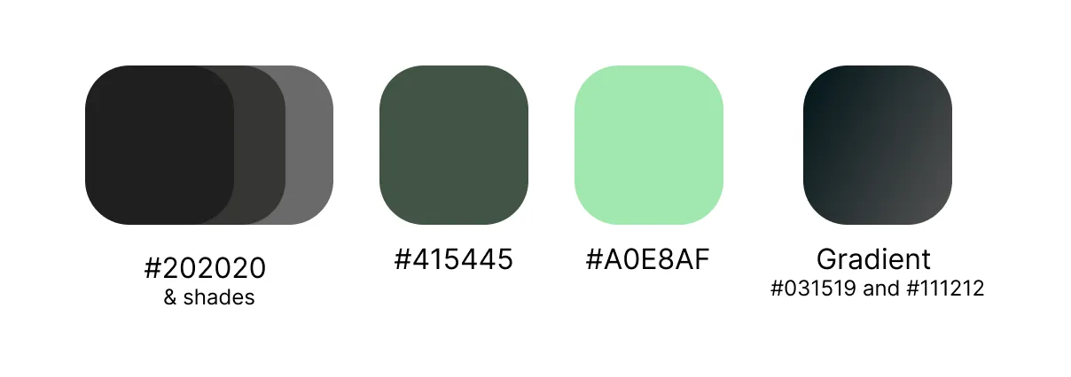
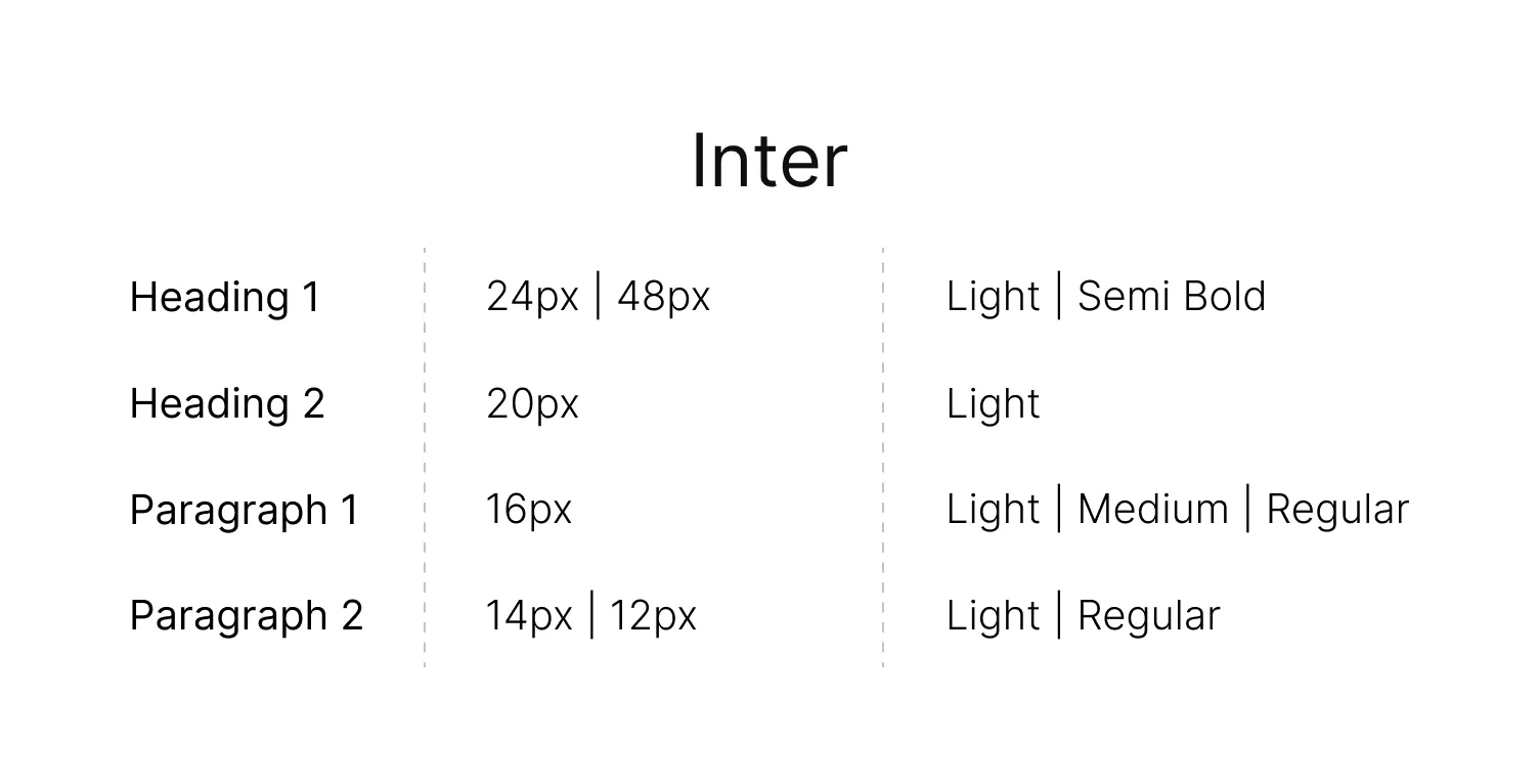
I started the branding process by building out a style guide for the designs -
- Color palette: The color palette I chose was WCAG compliant and included a dark matte for the background with bright, contrasting colors for alerts, adhering to Gestalt's law of figure-ground for grabbing attention. I added hints of green to primary components to symbolize health, and eye-catching orange/yellow shades for various levels of critical alerts to ensure immediate cognitive differentiation and quick reaction time.
- Typography: I focused on a clear, easy-to-read font with adequate size, contrast, and spacing to enhance readability even under pressure.
- Screen layout: I opted for a clean, sleek, and minimalistic layout with clear hierarchy and ample white space, minimizing visual clutter and allowing nurses to scan information quickly and efficiently. Gestalt’s law of good figure helped me out here.
- Touch dimensions: I chose appropriate touch dimensions, keeping Fitts' law and the Aesthetic-usability effect in mind, i.e., both usable enough and visually appealing.
- Accessibility: The color shades and typeface I chose are all WCAG AAA-compliant and don't contrast too much with the background to not strain the eyes of users.
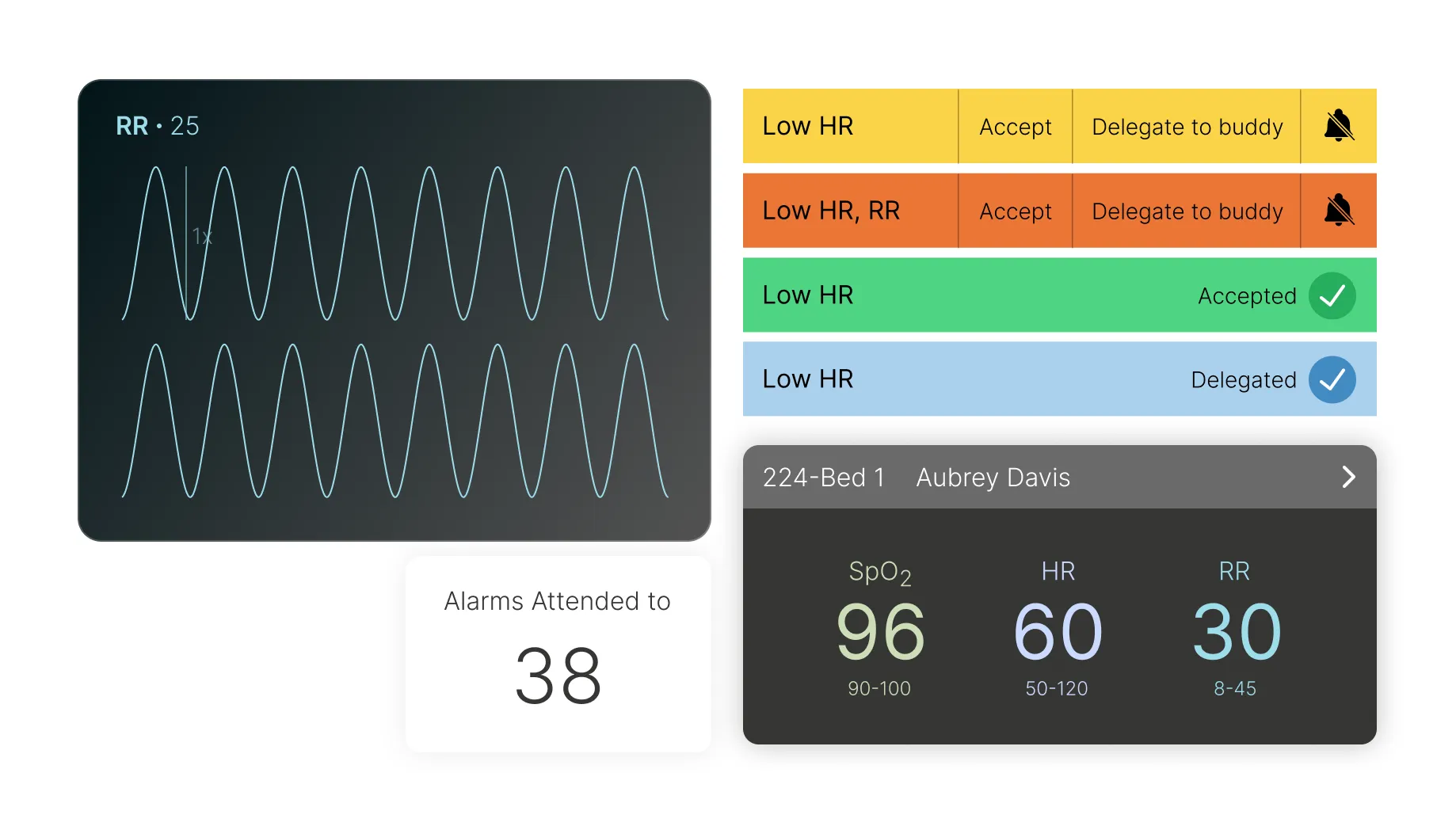
The 3 Core Flows
Critical Patient Metrics Simplified
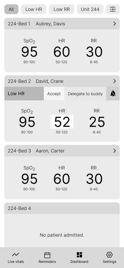
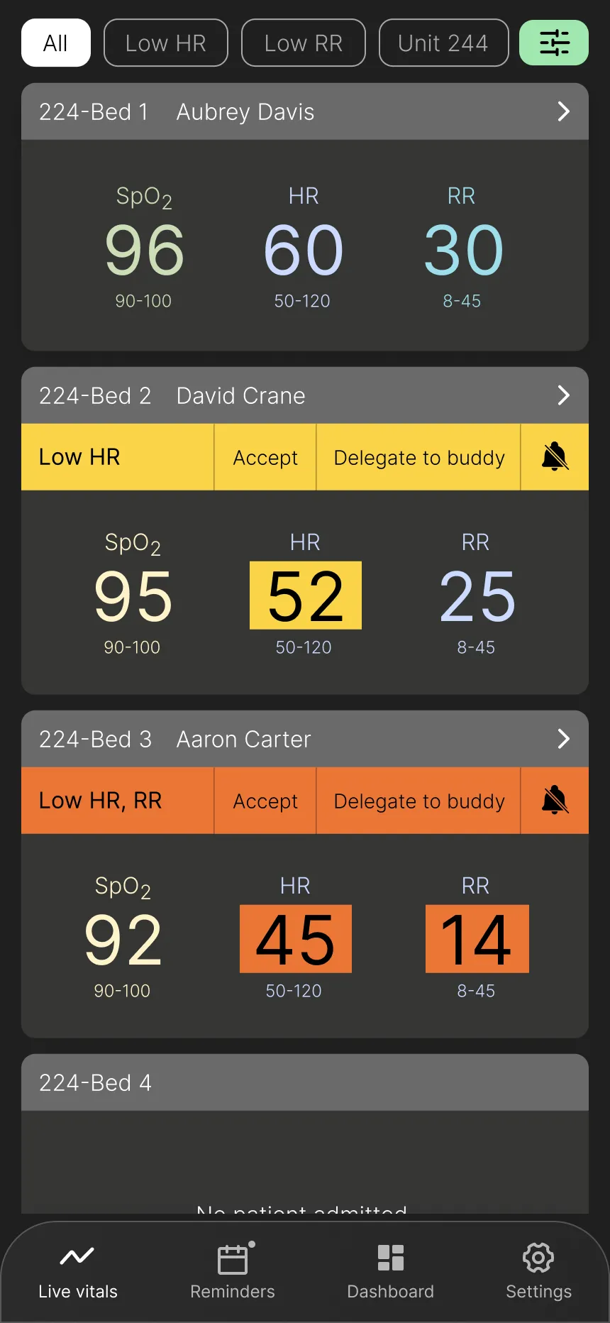
Design Goal: Provide a scannable overview of key patient data for quick assessment.
Key Design Elements:
- Key information in a scannable list format.
- Prioritization of the three most vital signs based on user research (surveys and interviews), which are customizable.
- Filters and sorting options for empowering nurses to personalize their view and access specific data efficiently.
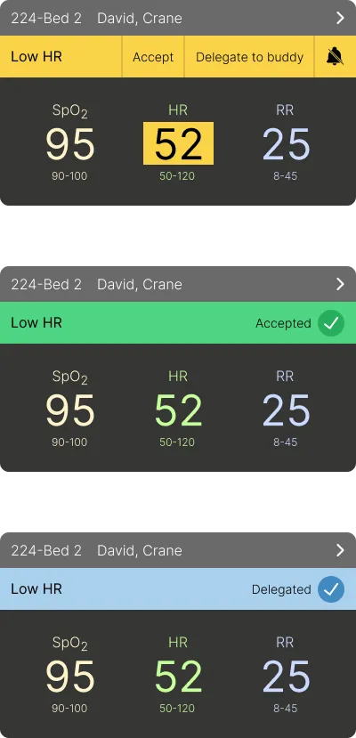
- Prominent alerts with three clear interaction options, based on Hick's law, for immediate action.
- Highlighted vital(s) causing the alert for user clarity.
- Navigation menu at the bottom to meet mobile users' expectations.
User Impact: Nurses can quickly assess multiple patients, focus on critical information, personalize their view for efficient data retrieval, and easily manage alerts with minimal cognitive load.
Vitals View
Alert Interaction Options
Comprehensive Patient Vitals at a Glance
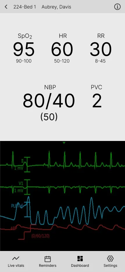
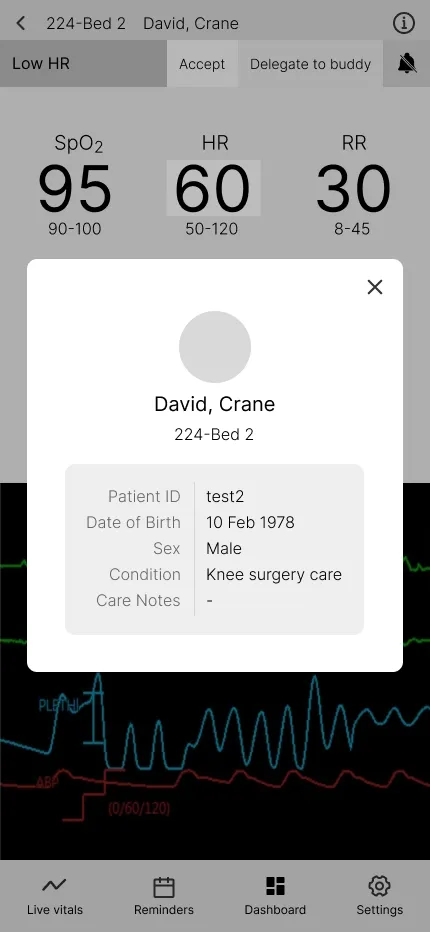
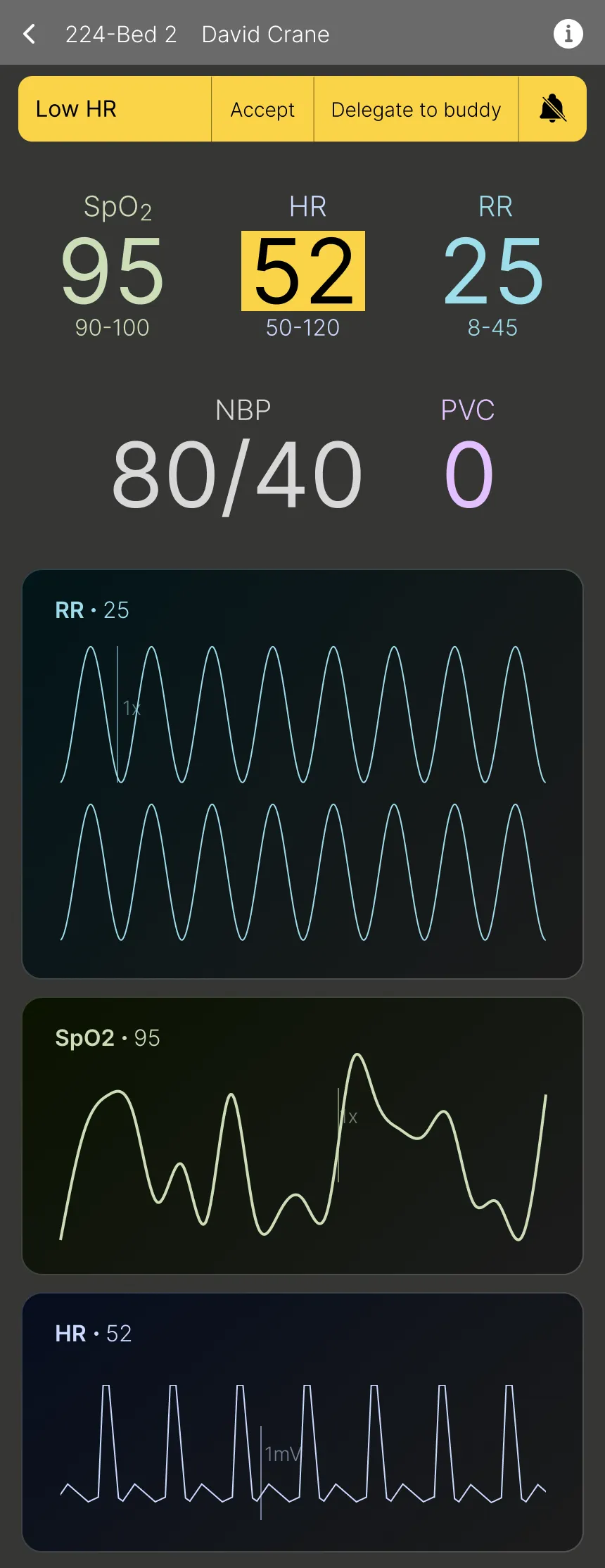
Design Goal: Provide in-depth vital details of a patient, allowing remote monitoring of all the key information.
Key Design Elements:
- Display of all vitals and monitor readings for a comprehensive overview.
- Consistent alert handling with the same interaction options for efficient management.
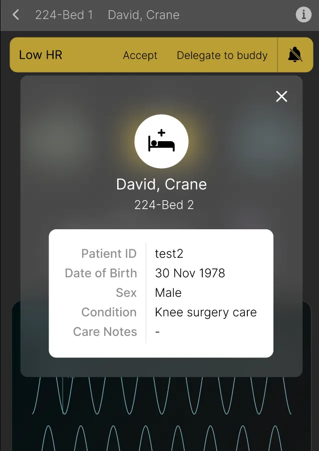
- Accessible basic patient information like surgery type and date of birth for convenience.
User Impact: Nurses can quickly view all vitals and basic patient details without needing to go anywhere else in a seamless manner.
Detailed Vitals View
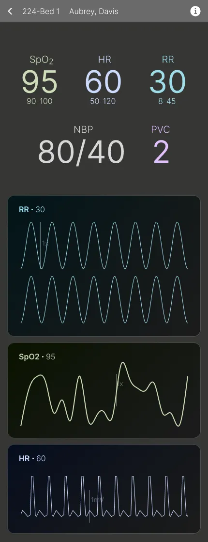
With Alert
Patient Details Overlay
Empowering Decision-Making with Actionable Data
Design Goal: Enable informed decision-making with detailed nurse shift and alert statistics.
Key Design Elements:
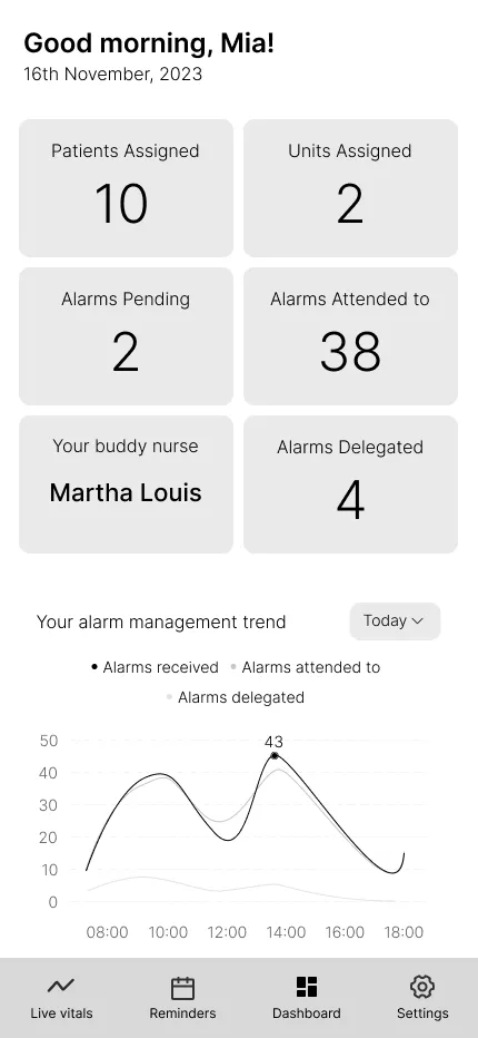
- Card layout with concise, quick stats for fast information scanning.
- Nurses can analyze detailed vitals, understand alert patterns, and make informed decisions based on comprehensive data visualization.
- Increased font size for key statistics for improved readability.
User Impact: Nurses can analyze their workload, understand alert patterns, and make informed decisions based on comprehensive data visualization.

Reflection & Next Steps
End of a Journey
This was an extremely fun and challenging project, given how big the initial scope was. It solidified my understanding of user-centered design by directly translating research findings into actionable design decisions, thus strengthening my core UX skills.
- The ROI of research: The two-month, two-stage research phase was critical for risk mitigation, allowing us to identify a precise problem (less-critical post-surgery units) that maximized the potential for organizational adoption and minimized implementation resistance.
- Designing for data abstraction: In a data-dense domain, the primary design challenge was abstracting critical, real-time vital signs into simple, scannable, and actionable mobile alerts that adhere to WCAG standards.
- Strategy for cross-functional alignment: In a tight, three-month team environment, we found that establishing a clear process for managing our timeline and deliverables was essential. We leveraged tools like Airtable to set deadlines, track research interviews and findings, and Google Drive to manage all our assets.
The next steps would be to complete designing the high-fidelity prototype, test it, implement the application, and develop it further with the funding received, with a core objective to reduce the number of clinically insignificant alarms presented to the nurse by 75% and eliminate 50% of unnecessary bedside verification trips in the first six months after launch.