CLIENT PROJECT
DESKTOP | MOBILE
BESK
Year
2023
TL;DR: Managed the end-to-end transition from word-of-mouth operations to a digital brand. Handled the full project lifecycle, including stakeholder requirements, site launch, and post-launch maintenance.
Explore Interactive PrototypeScope
Product Design
UI/UX Design
UX Writing
Site Management
Site Launch
Tools
Wix, Figma, Google Meet
Screens
6 screens
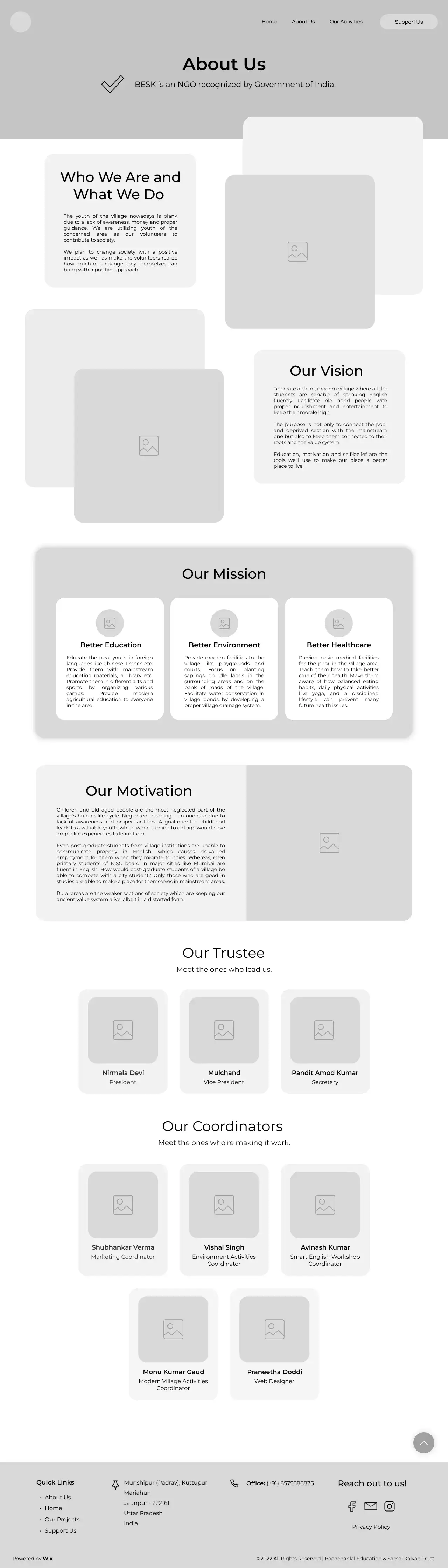
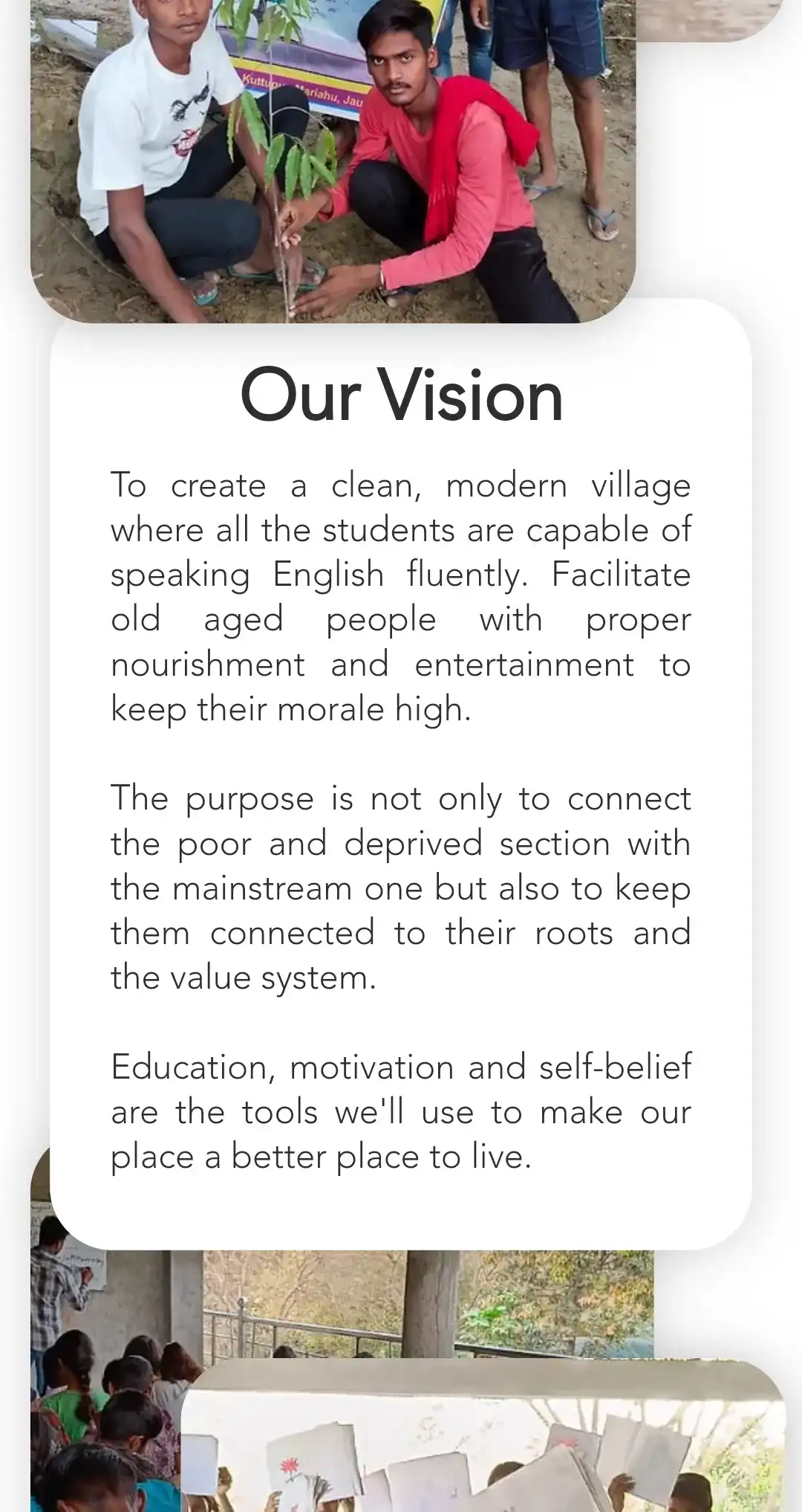
Overview
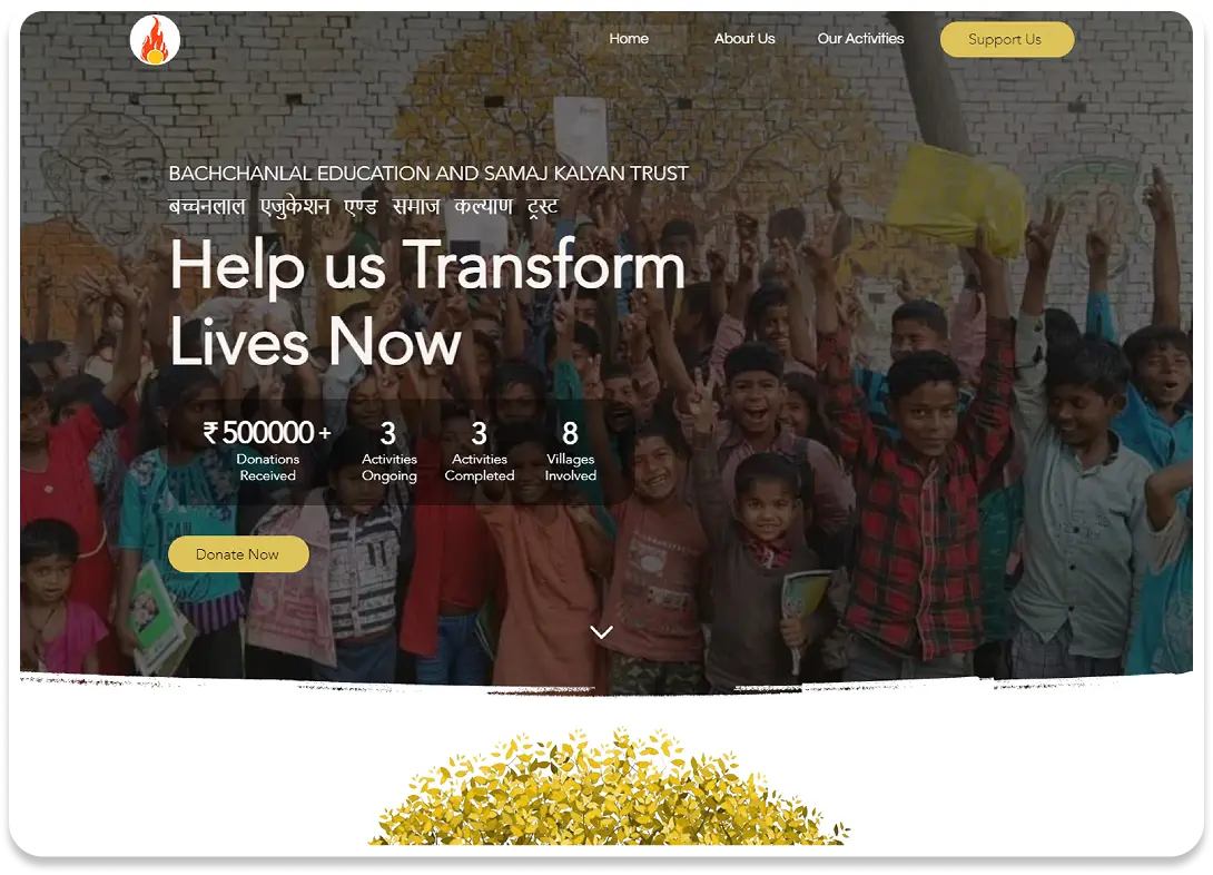
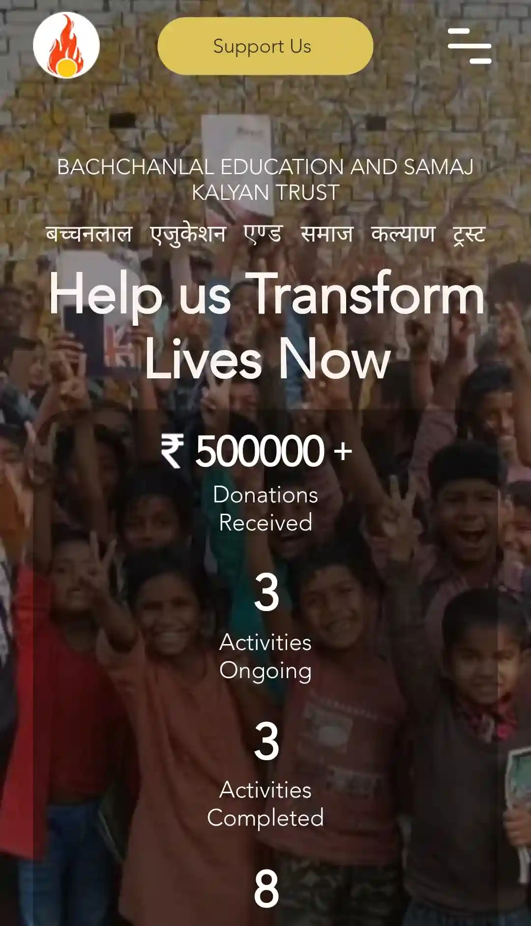
From 0% Presence
to 40K+ Raised
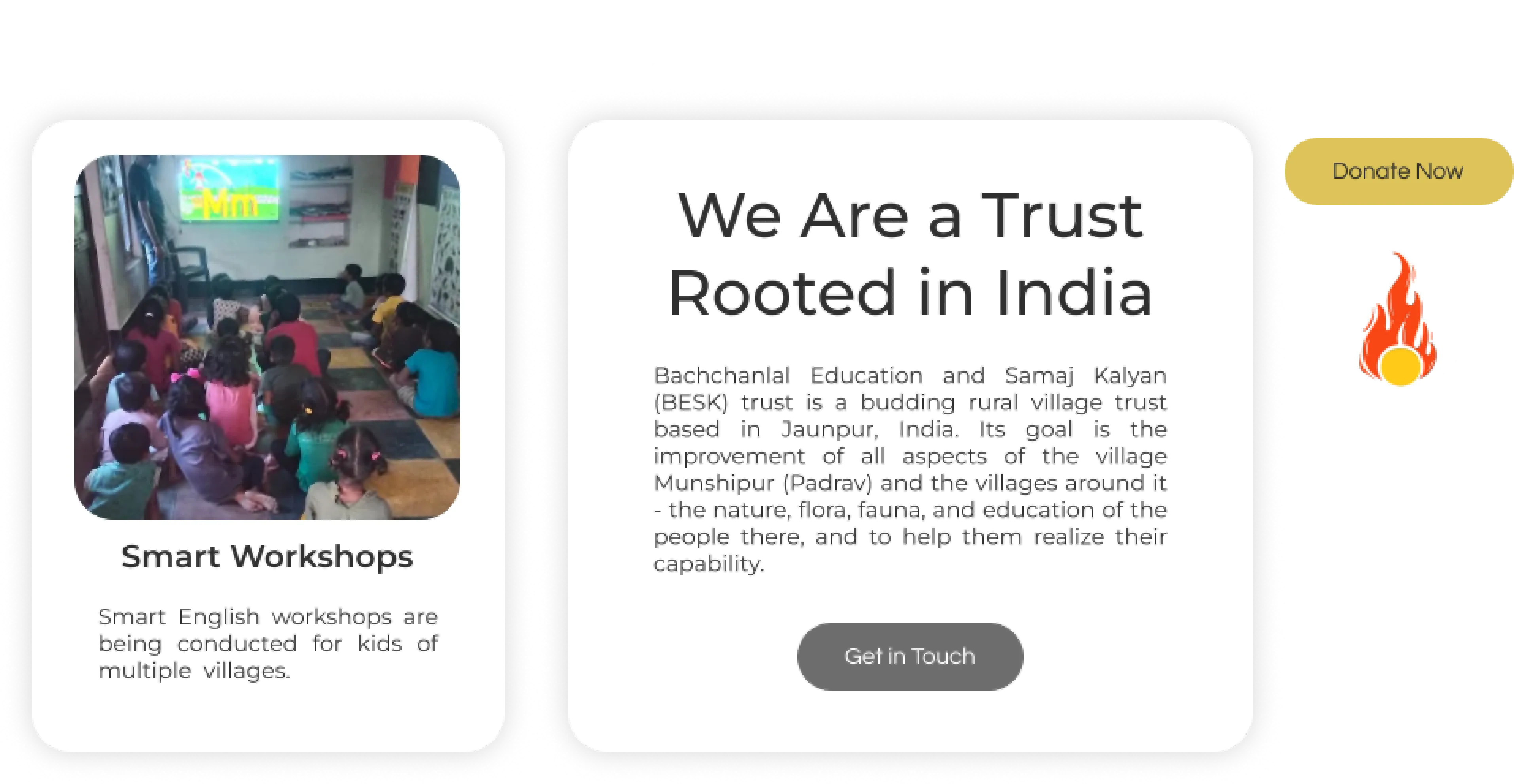
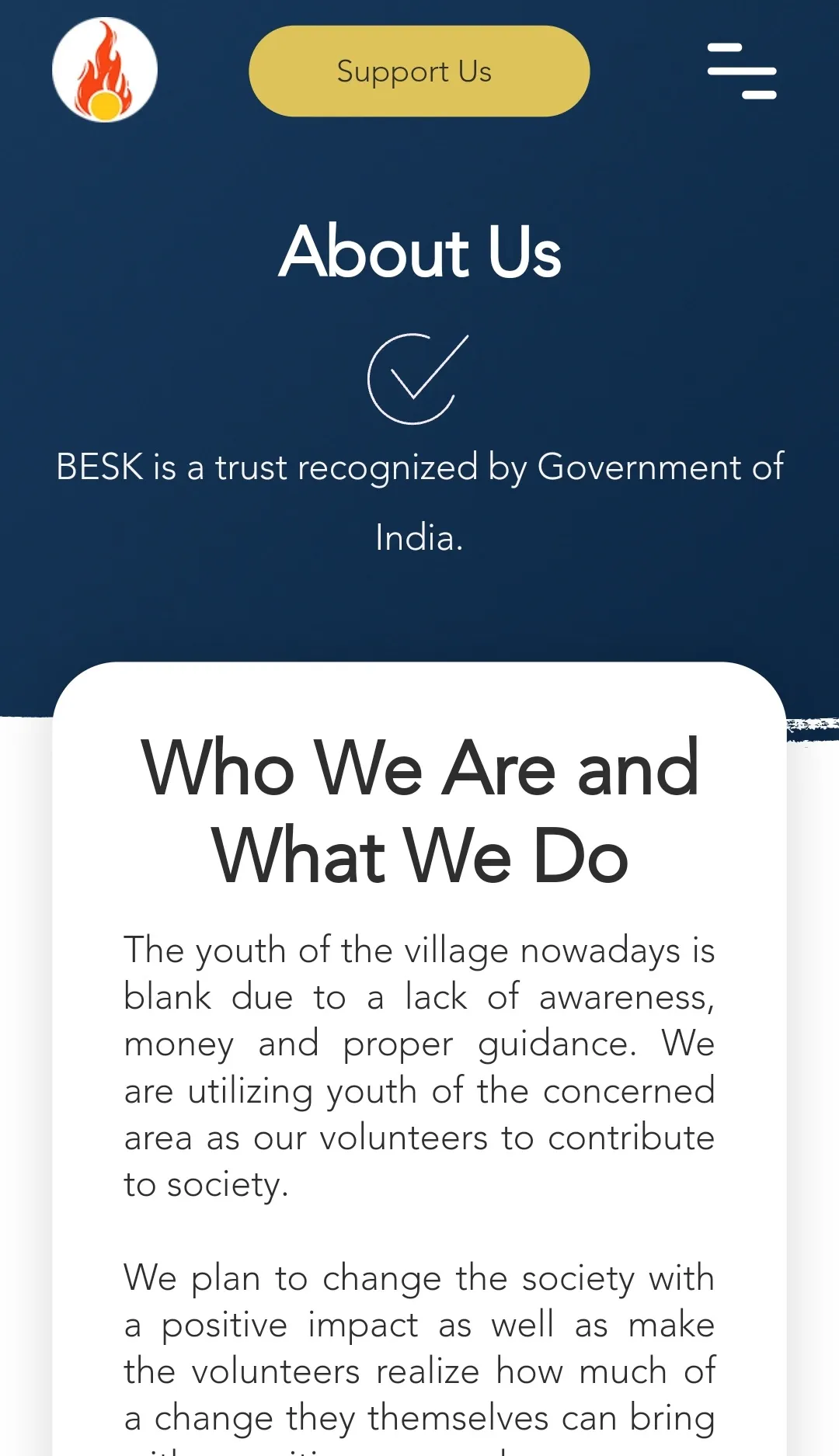
Jump to SolutionThe Bachchanlal Education and Samaj Kalyan (BESK) Trust, located in Jaunpur, India, is an emerging rural village organization. It aims to foster the development of Munshipur (Padrav) village and its surrounding areas. The trust's objectives include enhancing the environment, providing better healthcare, promoting education among villagers, and empowering them to realize their full potential.
Given our prior acquaintance, the trust leader approached me for assistance, and I jumped at the opportunity to build their website and extend their outreach.
40K+
increase in donations via the website in Indian Rupees.
~100%
of participants appreciated the design and ease of use of the website
2
languages implemented (English & Hindi) for reaching a wider Indian audience
Challenges
The trust's 0% digital presence and 100% reliance on word-of-mouth, newness, and lack of brand identity restricted its reach, leading to a lack of donations, which in turn, limited its activities.
Goals
Craft a compelling brand identity and a live website to expand the trust's reach on the digital platform and attract donations and support as a result.
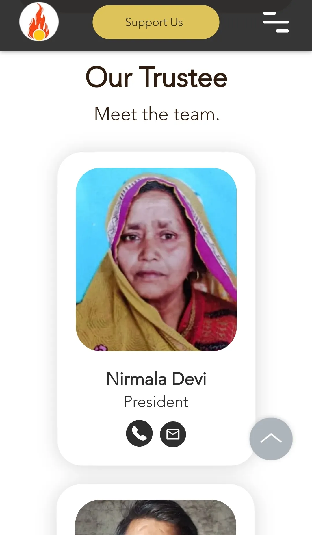
Role
Solo Designer
& End-to-End Ownership
Wearing multiple hats, I served as the sole designer and developer, taking ownership of the entire experience from research, wireframing, and branding to launch in Wix and regular maintenance for an entire year.
Design Process
Research to Launch
- Researching and analyzing competitors.
- Defining site architecture, information hierarchy, and user flows in low-fidelity designs.
- Designing a high-fidelity interactive prototype.
- Designing the product in Wix.
- Launching a test site in Wix and performing a 5-second test with users.
Empathize & Define
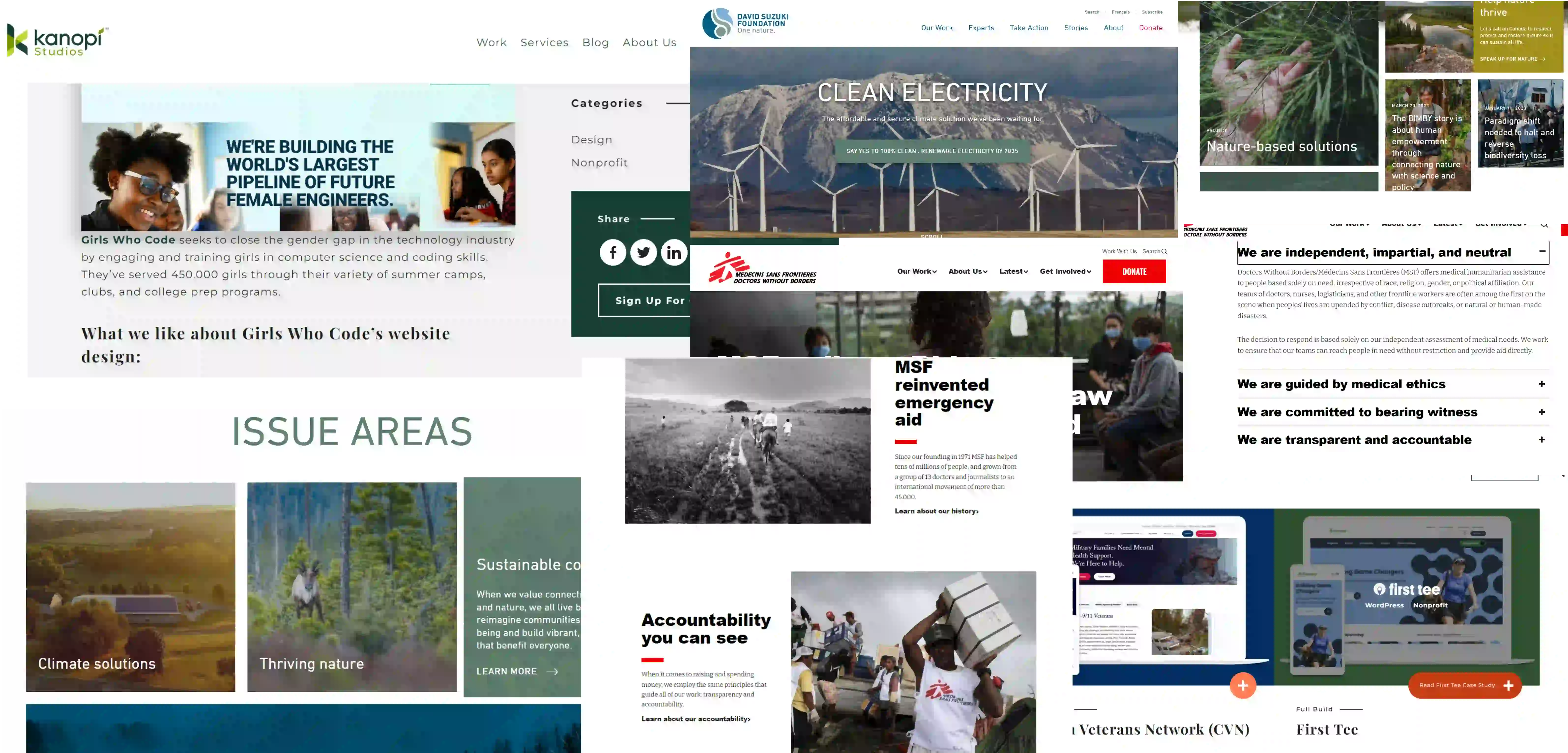
Insights from Competitors
I researched similar non-profit websites, gleaned insights to understand best practices, and created a mood board to establish a clear design direction emphasizing clarity, accessibility, and emotional connection.
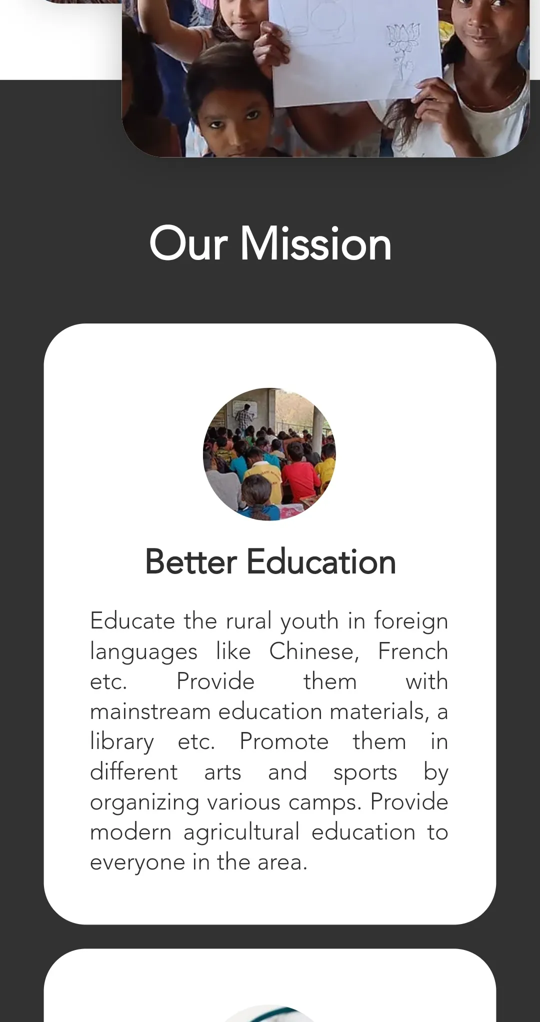
Key Understandings
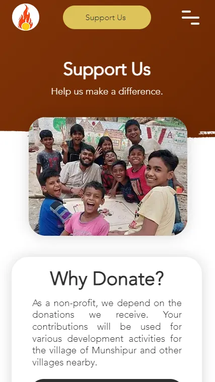
- Clear CTAs: Prominent calls to action encourage donations and volunteers.
- Transparency: Detailed information about donation usage fosters trust and accountability.
- Intuitive navigation: Easy-to-use menus and a logical structure promote seamless exploration.
- Minimalist design: Uncluttered layout reduces distractions and prioritizes key information.
Ideate
Information Architecture
& Wireframes
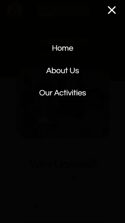
I started by analyzing the information architecture of the site, keeping navigation easy and the number of pages minimal for the initial launch, and came up with an initial sitemap.
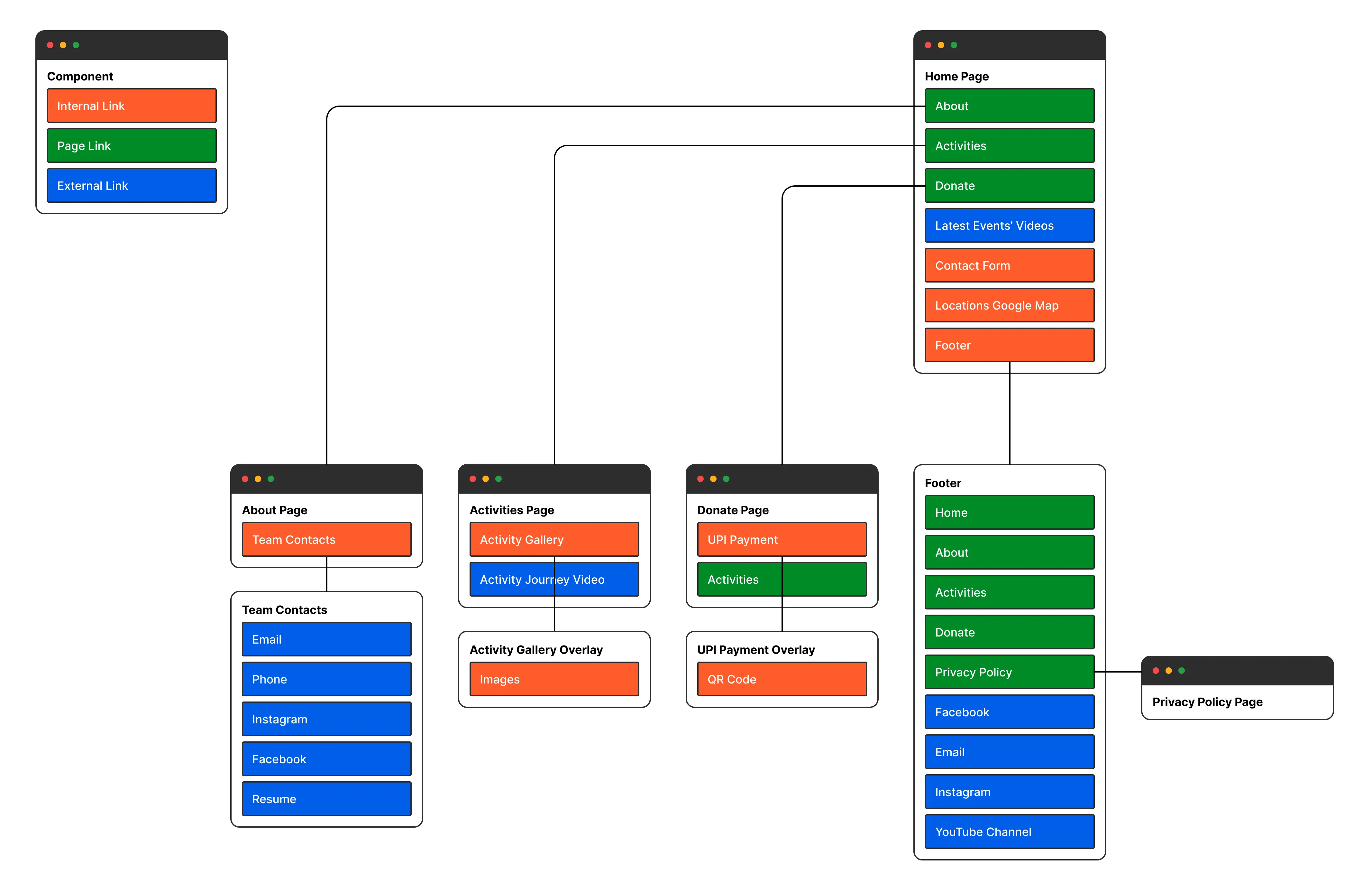
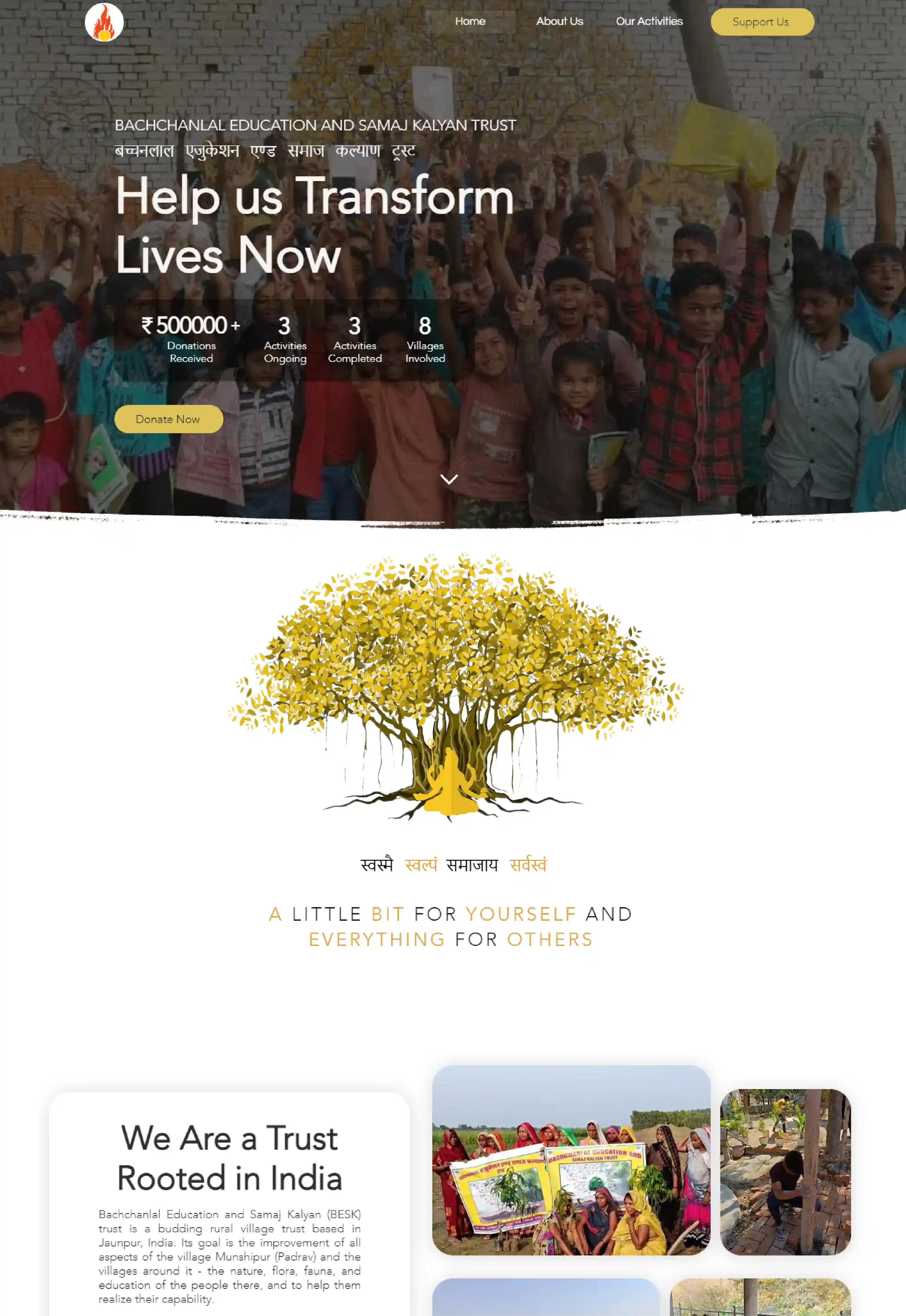
My objective with the design was to effectively communicate facts to users in a captivating and transparent manner, aiming to engage them as quickly as possible.
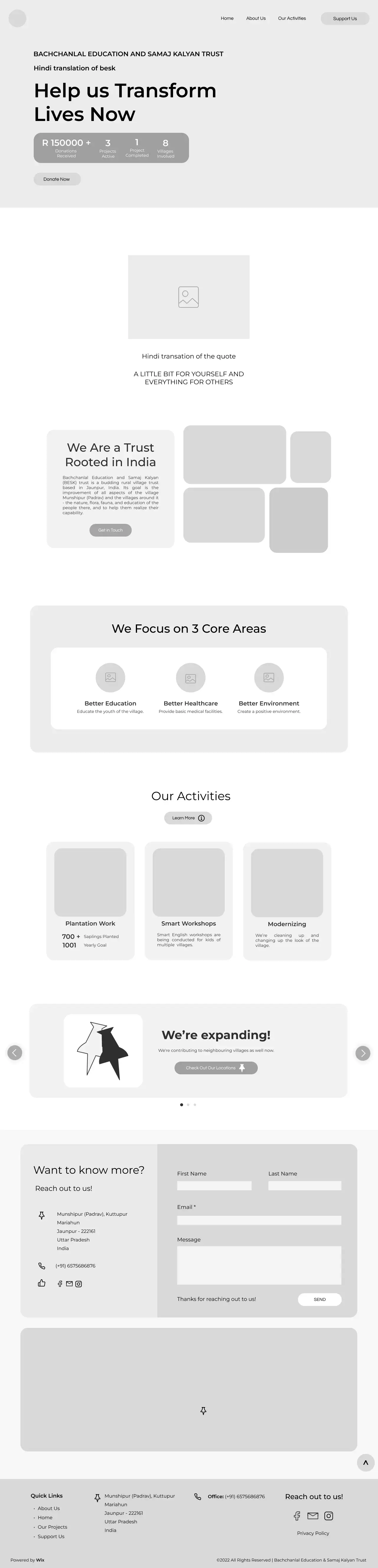
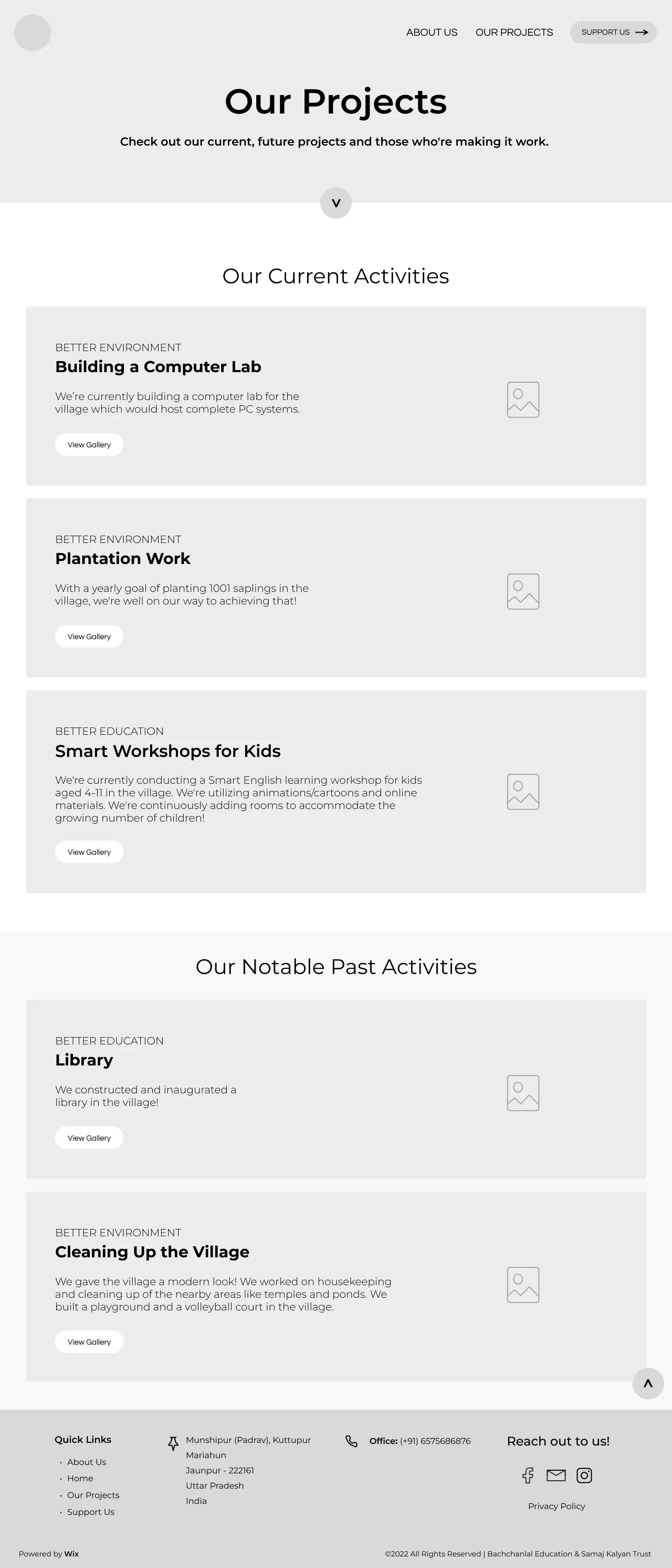
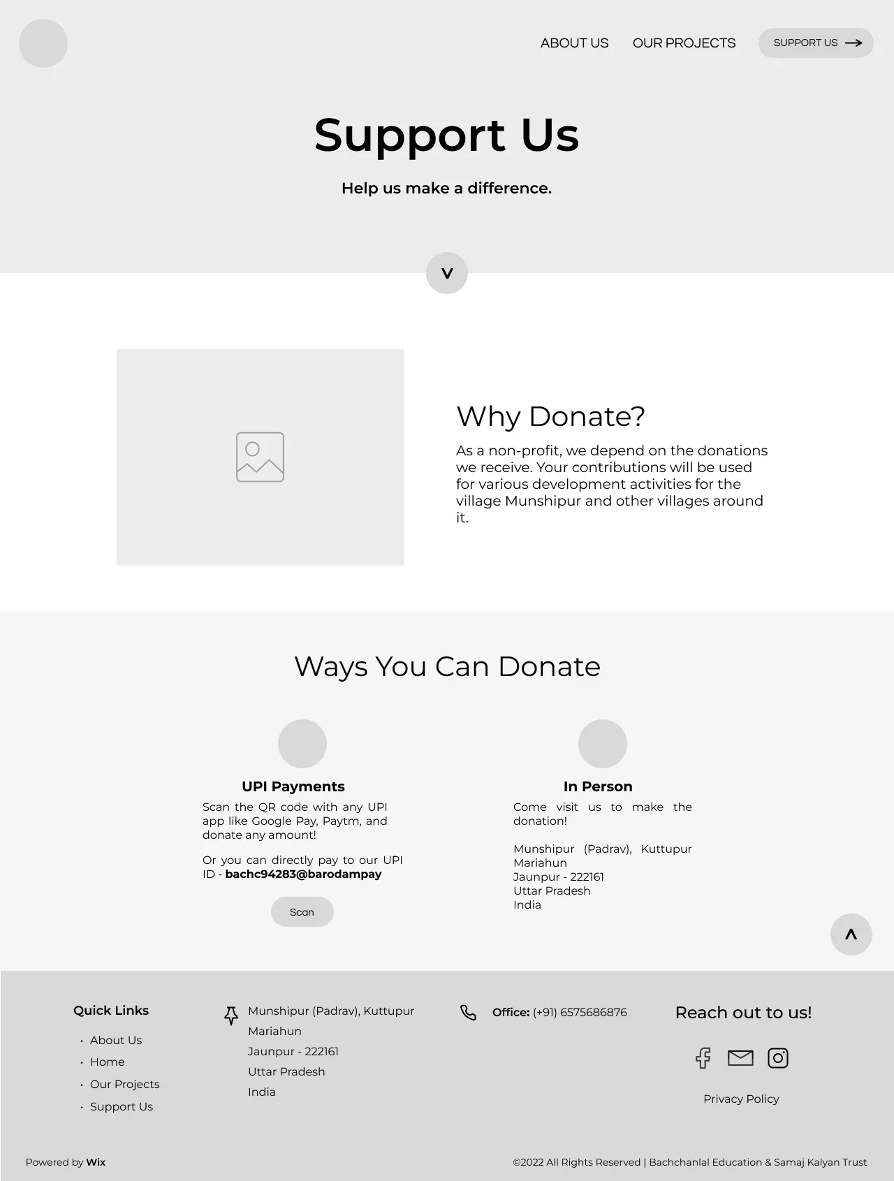
This meant the landing page needed to include statistics, tell a quick story of the trust, and include attention-grabbing CTAs. And so, I crafted the initial designs with a focus on clean and minimalist aesthetics, emphasizing ample white space to maintain simplicity, to highlight CTAs. I kept the content short and concise to make it easily scannable.
Design
Crafting a Brand New Identity
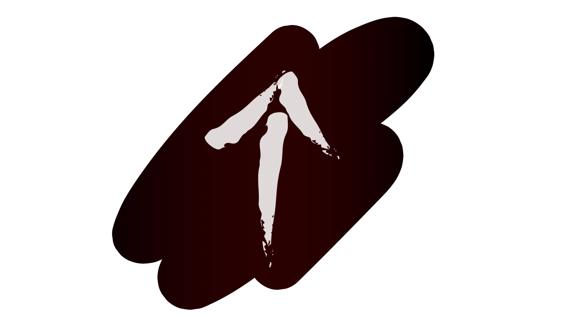
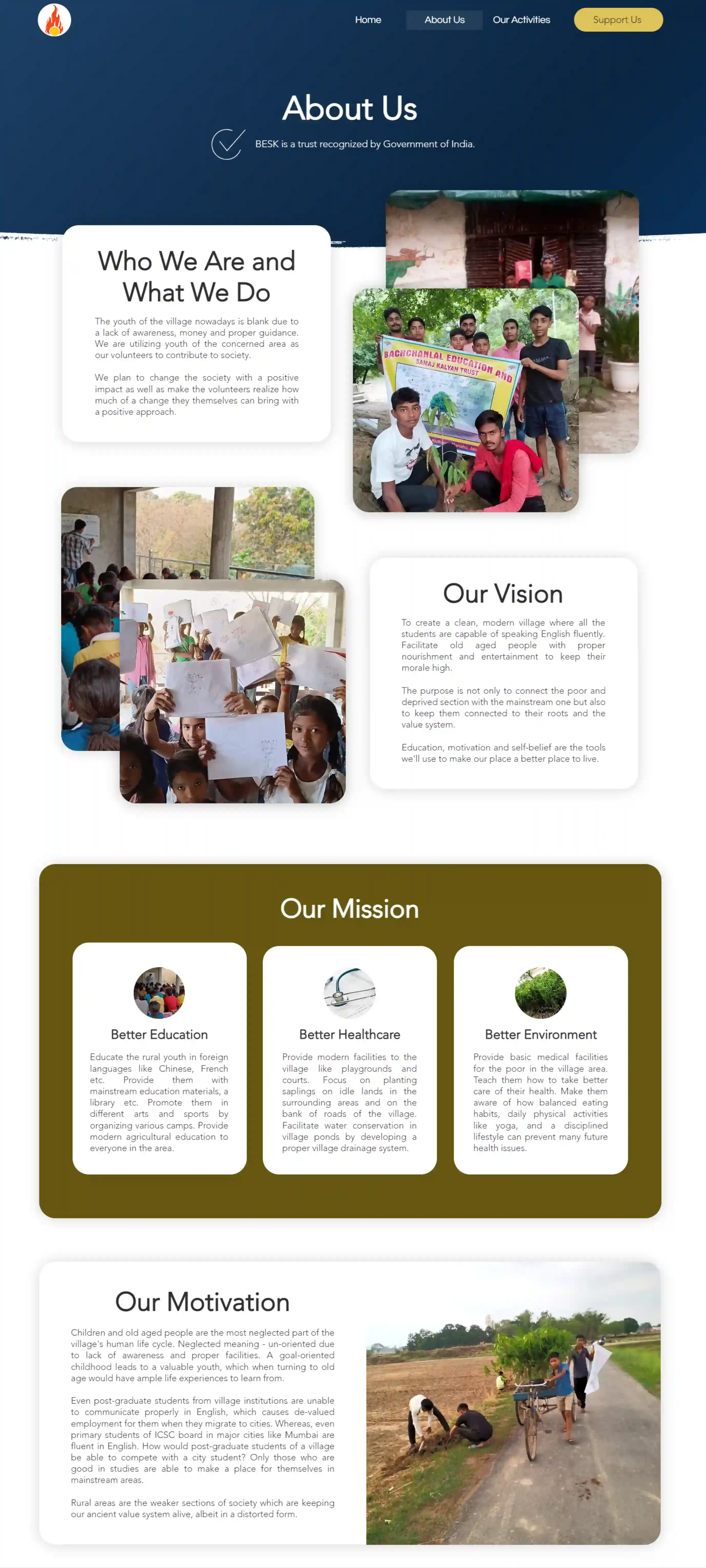
I began by going back to the trust's motivation — a commitment to positive change and enhancing the well-being of the community. This inspired the creation of the logo — a red, untamed flame symbolizing burning passion and a golden center symbolizing guidance, akin to the light of a candle.
I then built out the style guide along with various components — buttons, icons, cards, header, etc. in various states.
- Color palette: White and golden. White for its purity, and gold for wishing wealth, fortune, and prosperity to the community.
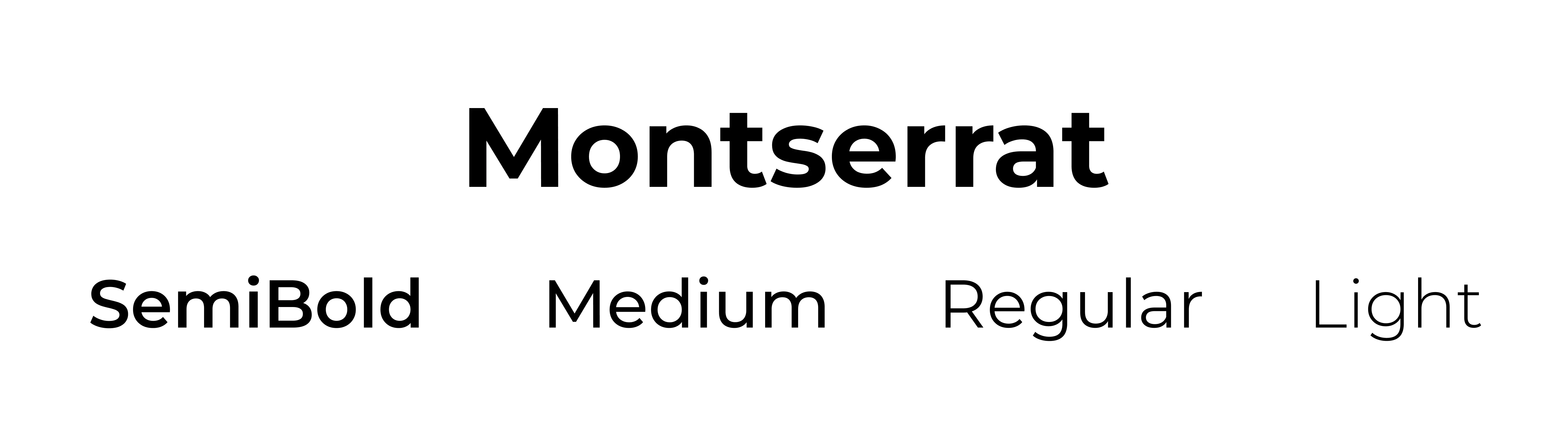
- Typography: A neat, clean, and easy-to-read font with adequate size, visual hierarchy, and enough contrast to be easily scannable on both desktop and mobile dimensions.
- Touch dimensions: I increased the touch dimensions for CTAs for mobile designs keeping Fitts' law in mind.
- Accessibility: All the background and foreground shades are WCAG-compliant.

Prototype
Figma to Wix Launch
I built a high-fidelity prototype by iterating over the wireframes in Figma first, and when it was complete, took it over to Wix. I added actual images of the trust performing its activities and proofread the written content provided by the trust's leaders.
I consistently collaborated with them to understand their activities, led multiple design reviews to understand their requirements and test variations out, went back and forth between Wix and Figma to understand Wix's workings and modify designs based on that, and when the basic features were complete, launched v1 MVP for testing.
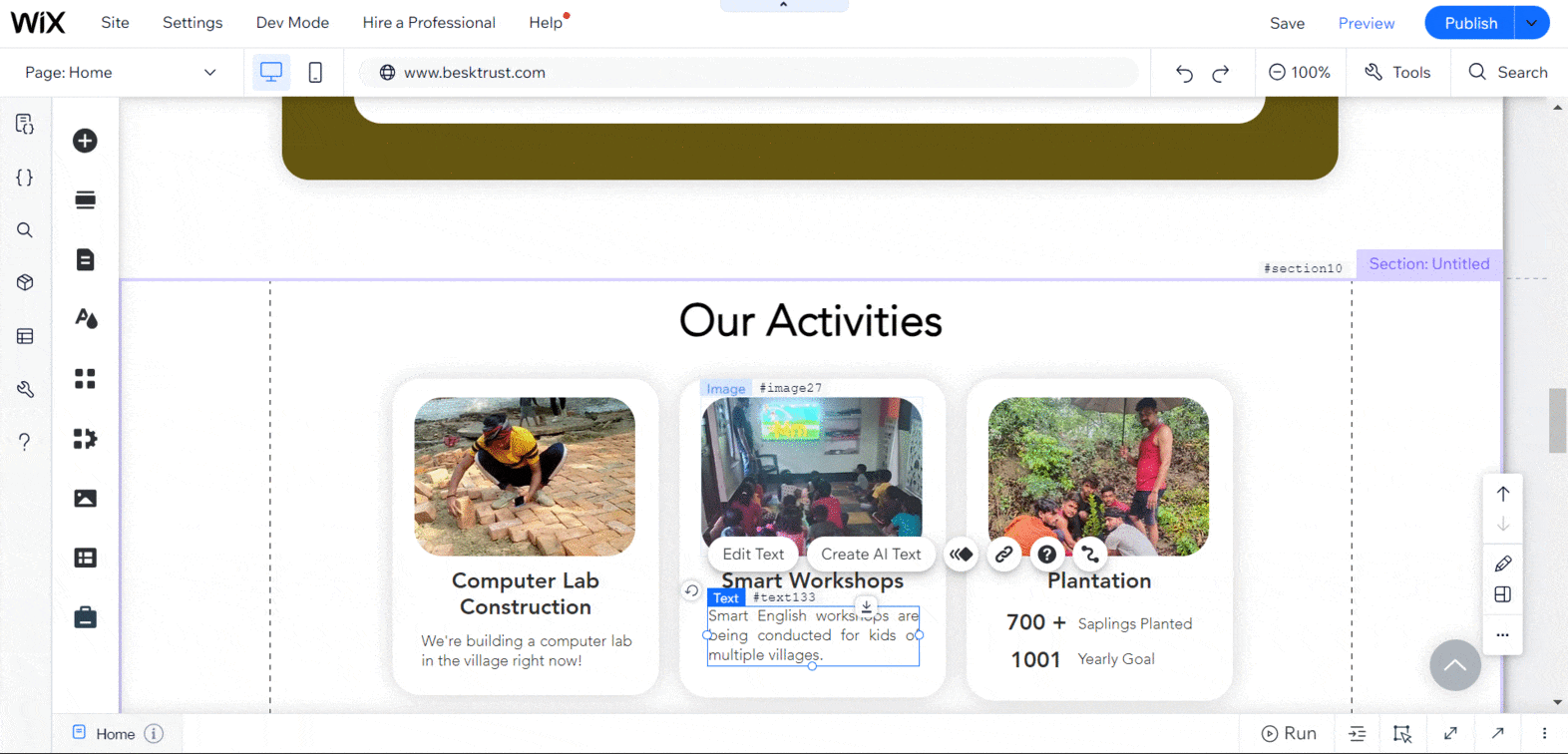
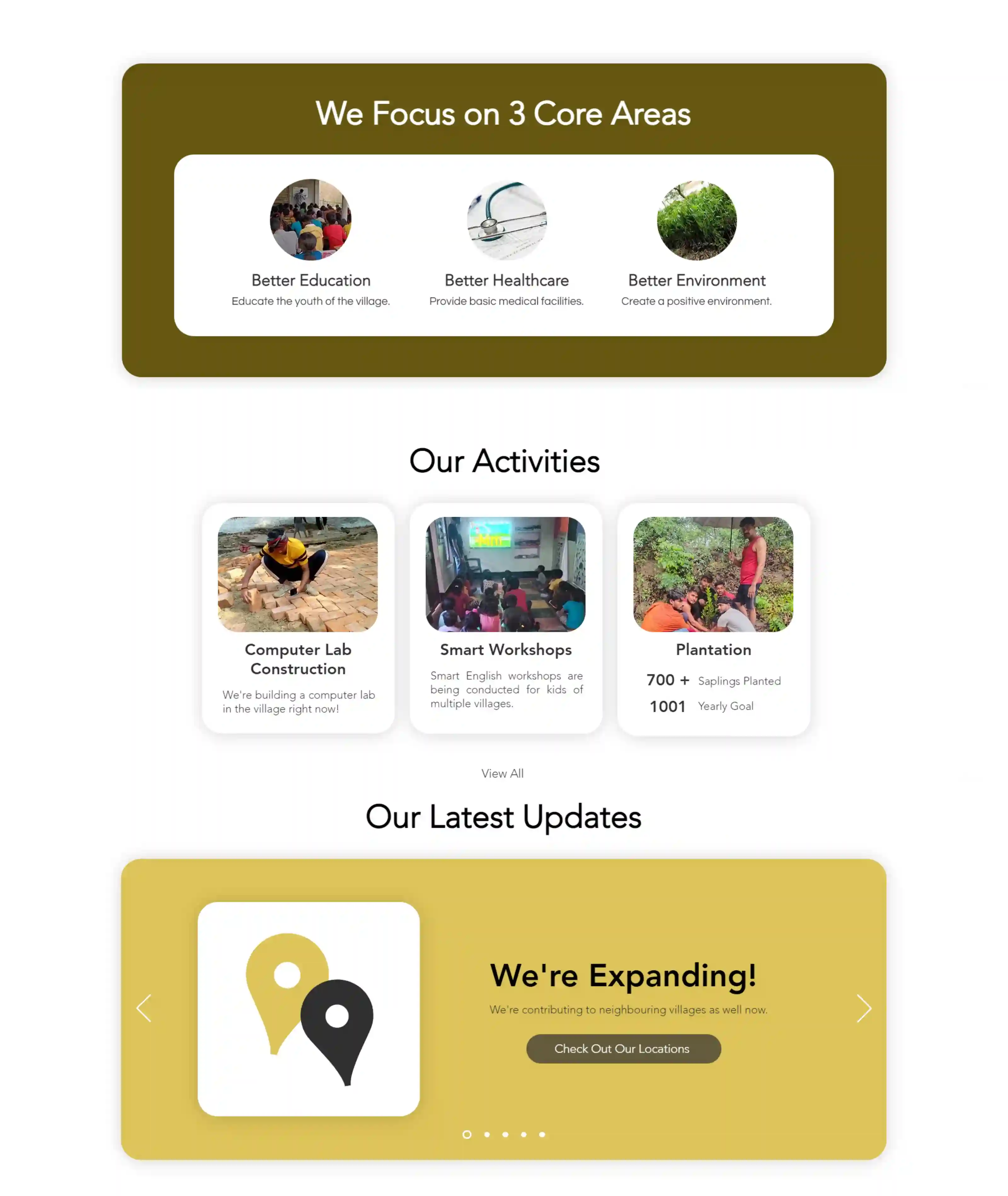
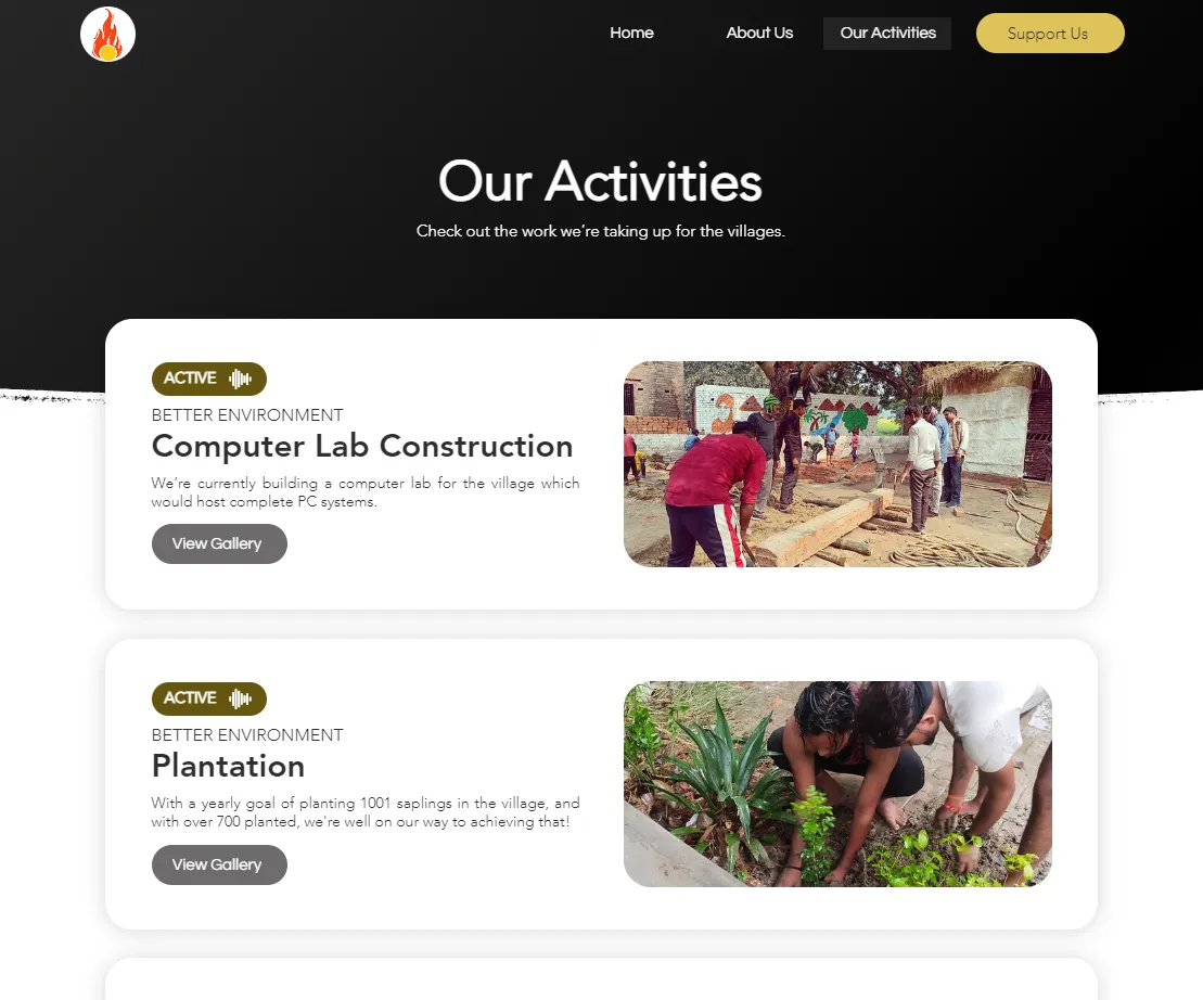
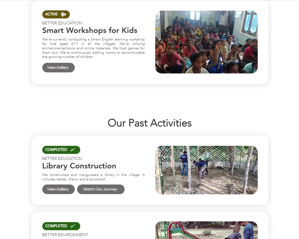
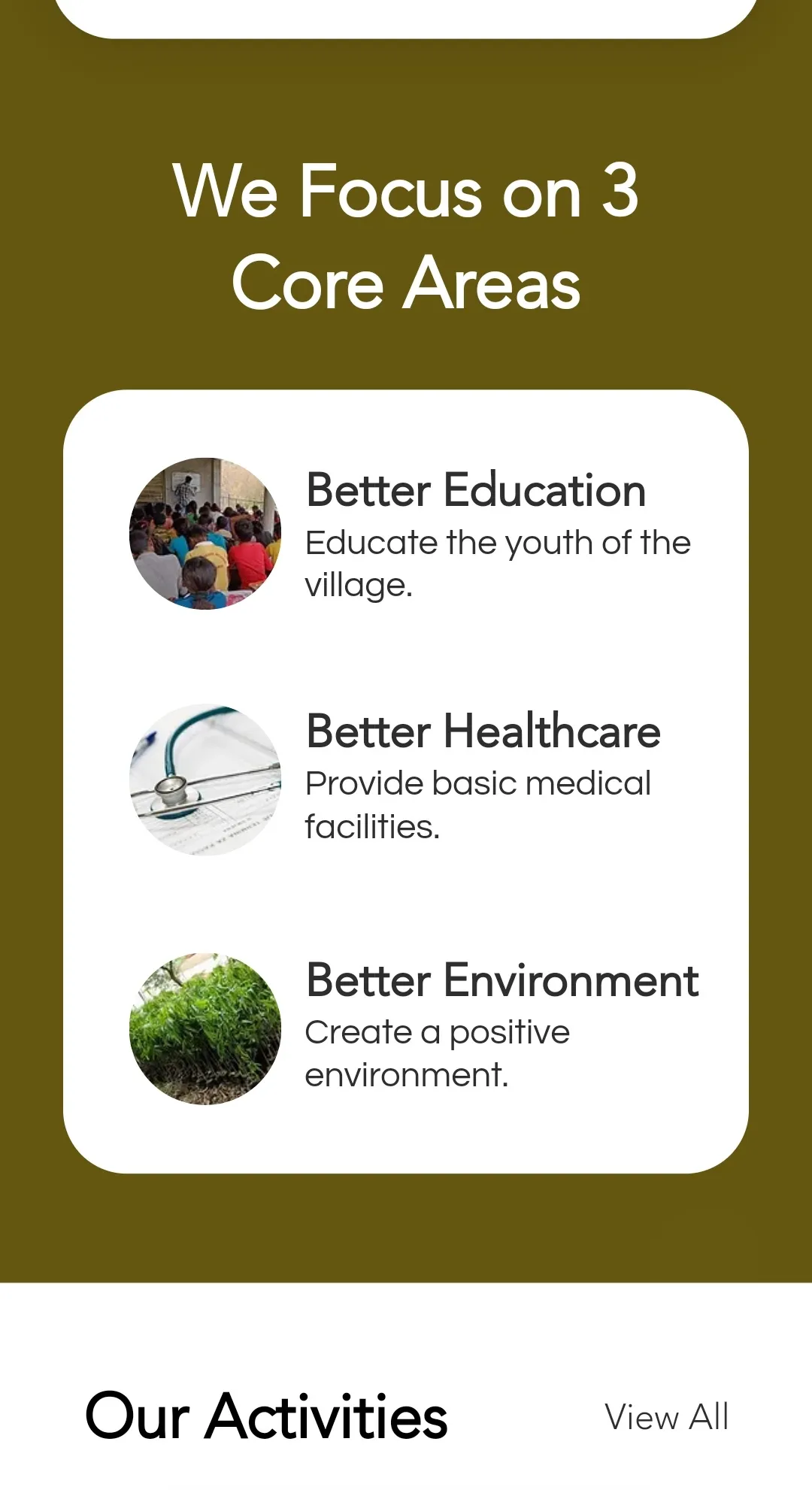
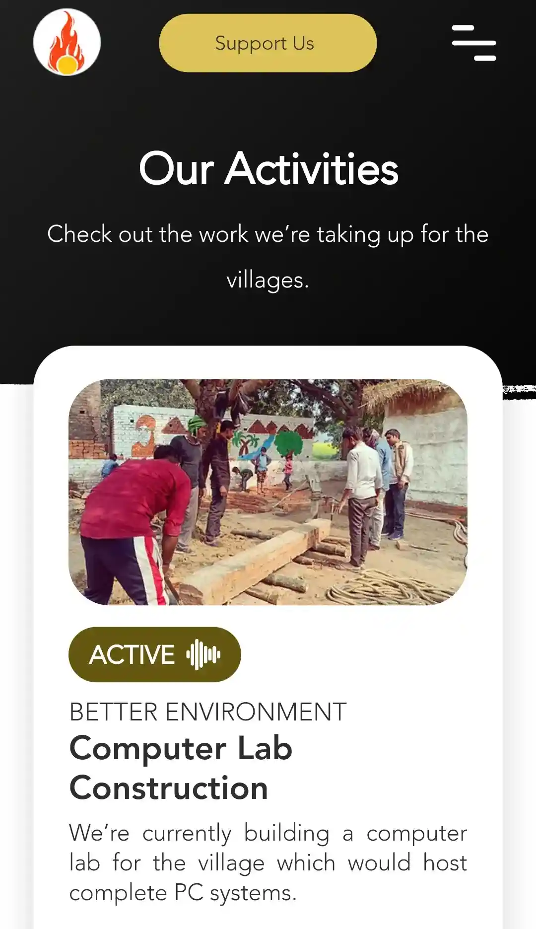
Key Design Elements:
- Card layout throughout the site to create a welcoming and user-friendly atmosphere.
- Key statistics at the top of the landing page.
- Key information in a scannable list format with clear, color-coded tags and statuses.
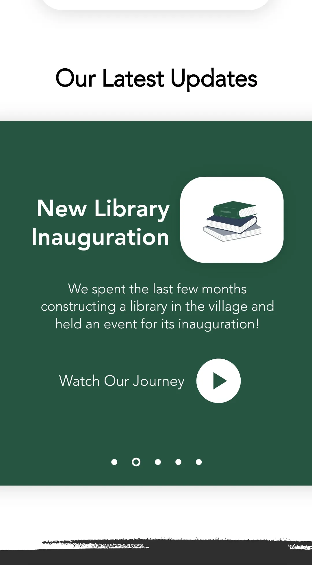
- Latest news in a less obtrusive banner format.
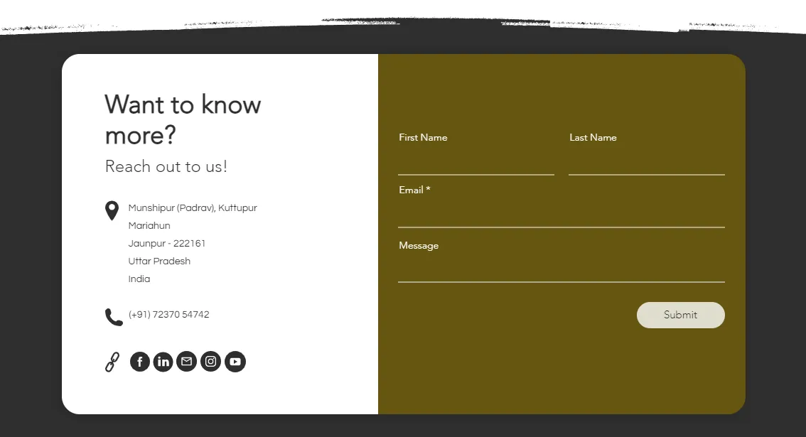
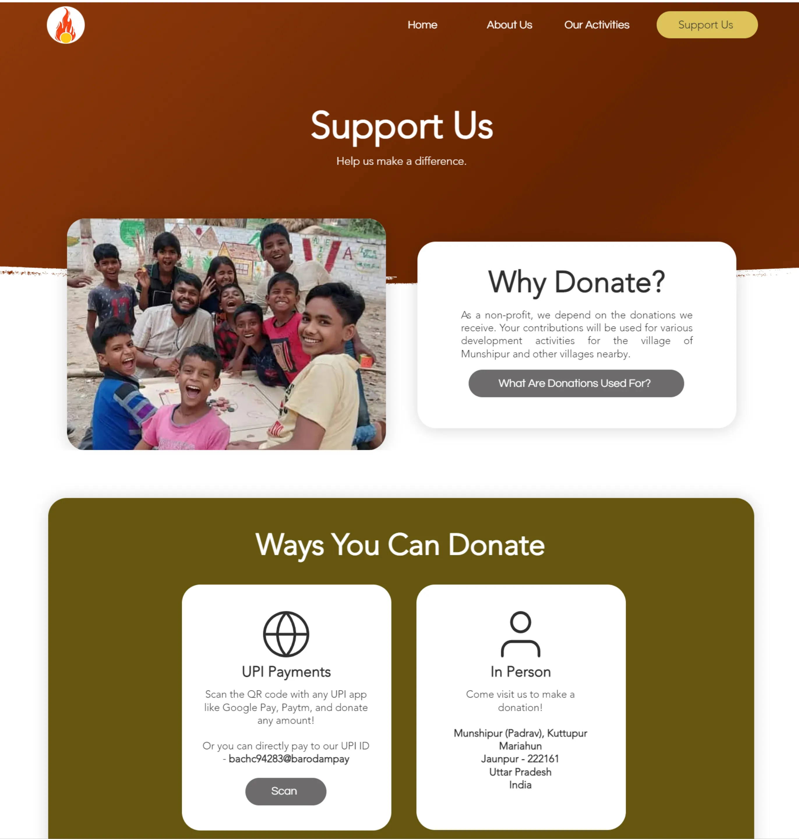
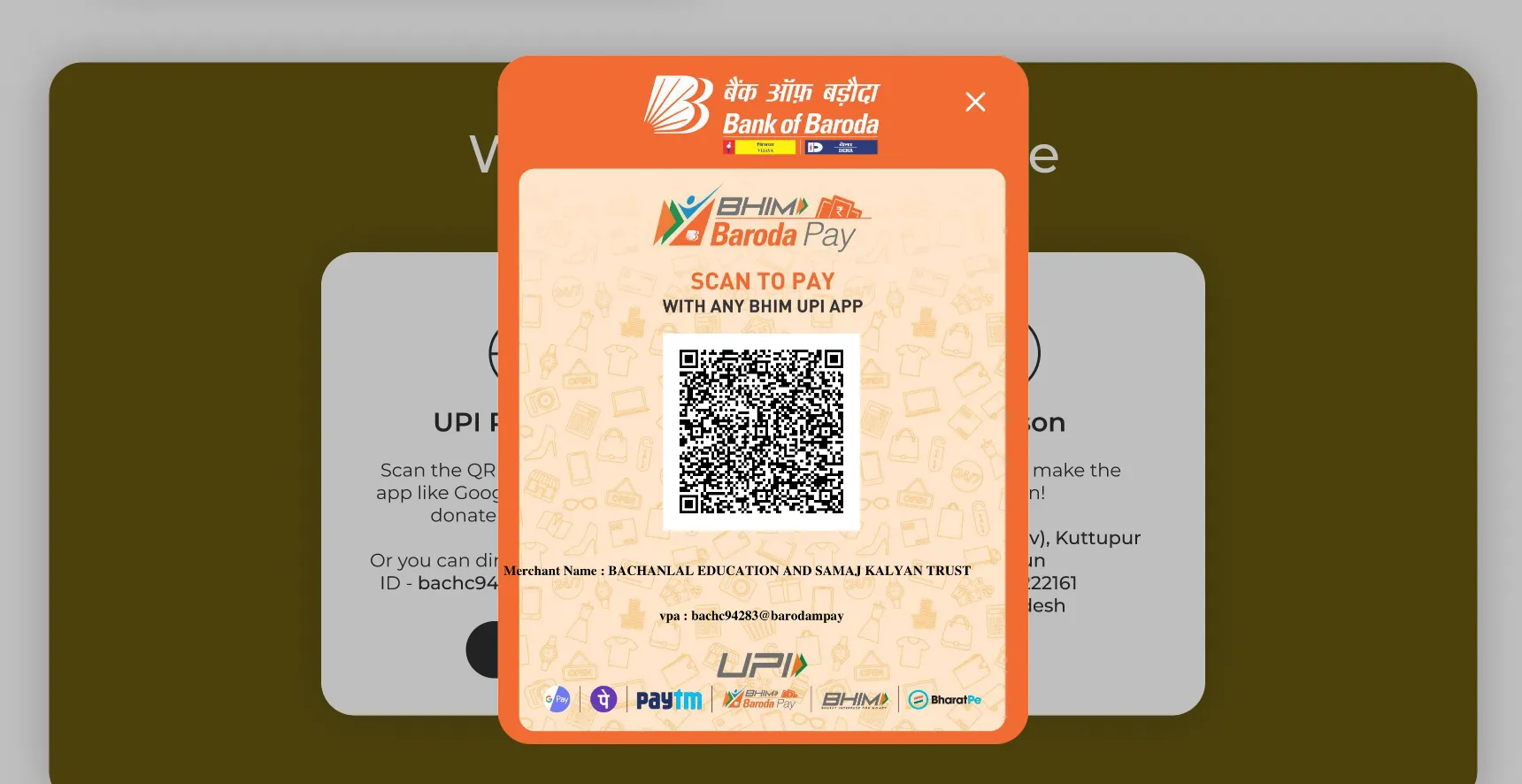
- Multiple CTAs for donation.
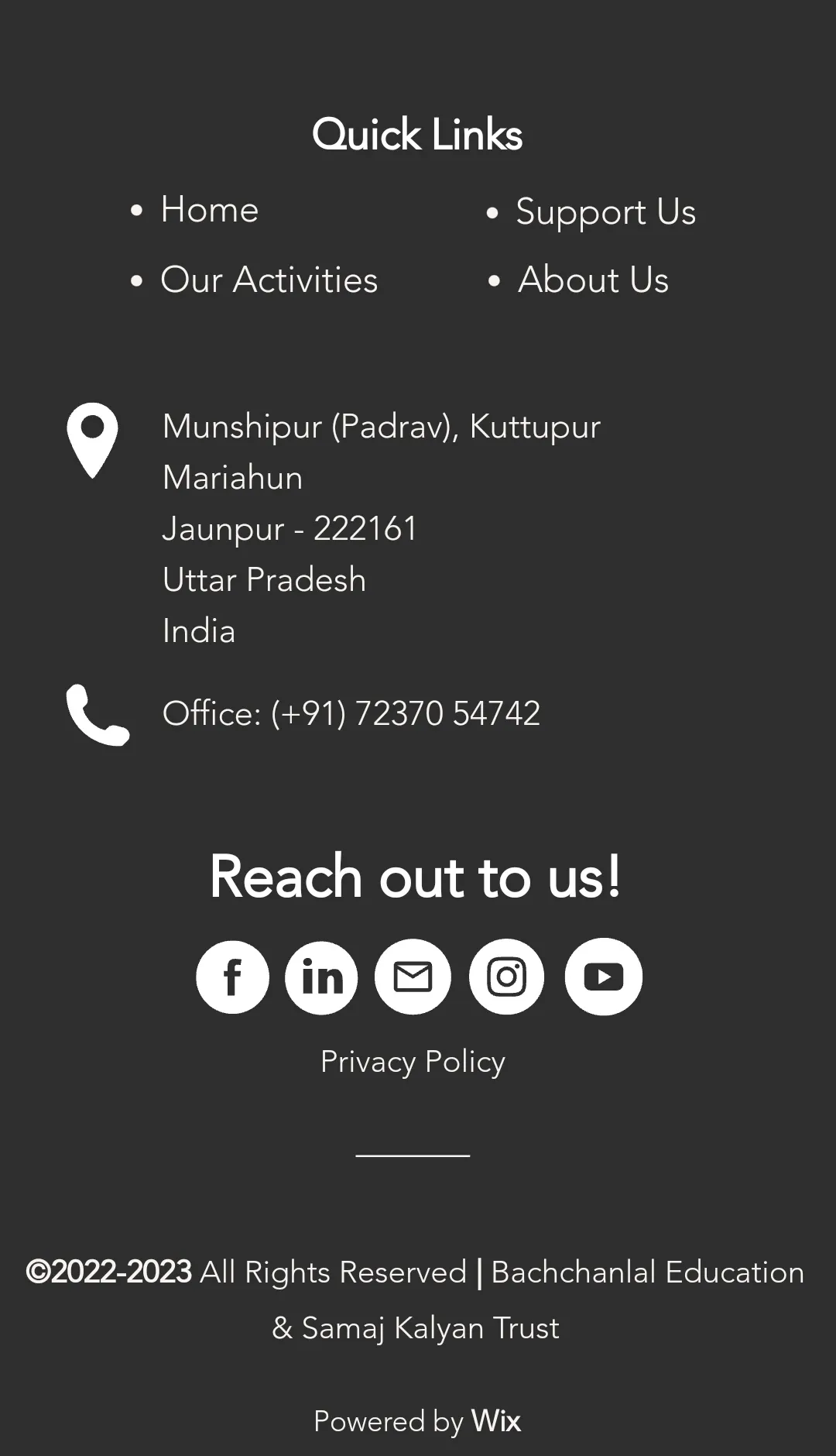
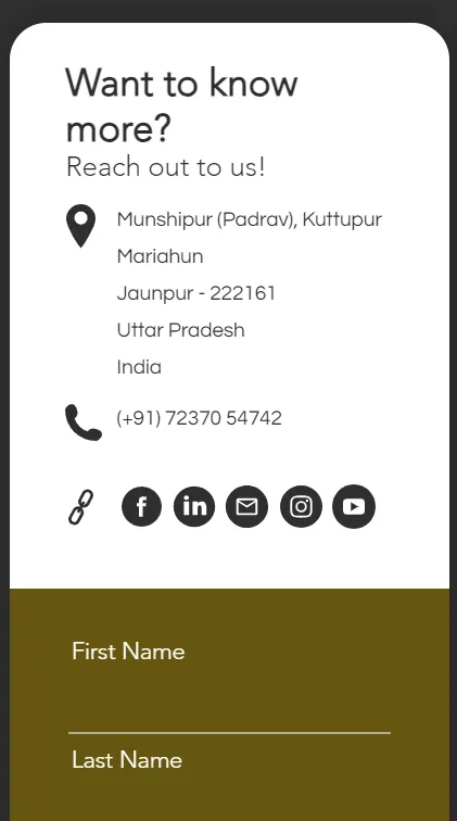
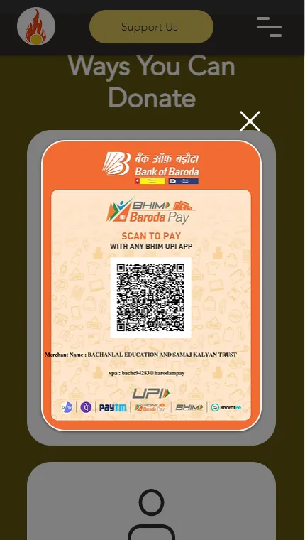
- Clear and concise contact and donation methods.
- Compelling storytelling by integrating captivating visuals across all screens.
- Bilingual accessibility for catering to a broader audience.
Test
The Five-Second Test
This test was conducted on a test site launched through Wix. Five participants were recruited for this test and were shown a few pages of the application through Google Meet for a short period. They were then asked their opinions on the design, things they could recall from the pages, etc. to determine the effectiveness of the pages.
Overall, the design proved to be quite effective in terms of being able to identify and recall key information. The organization’s logo, name, overall purpose, and donation functionality all caught the eyes of all of the participants successfully.
I asked the participants to view 4 pages from the site — Home, About, Donation, and Activities and asked general questions about what they could recall from what they saw, anything that stood out to them, if they understood the purpose of the page, and what their impressions of the design were.
The participants were almost an equal mix of graduate students and software engineers. They were within the age groups of 23-50, were equally split among male and female genders, and resided in India and the USA.
Each session took around 15 minutes, and additional feedback/suggestions on the design and site were taken at the end of the session. I noted down their answers as pencil notes during the sessions.
Here is How the Sessions Went
- Participants were welcomed for the first few minutes. Neither the general purpose of the test nor the product was introduced to the participants.
- A page from the test site was shown to them for five seconds and taken away.
- A set of questions about that page was asked for the next couple of minutes. This cycle was repeated for all the pages.
- Additional feedback was taken at the end of the sessions.
Key Highlights
- The majority of the participants correctly identified the purpose of each page.
- 100% of the participants liked how neat and clean the design was.
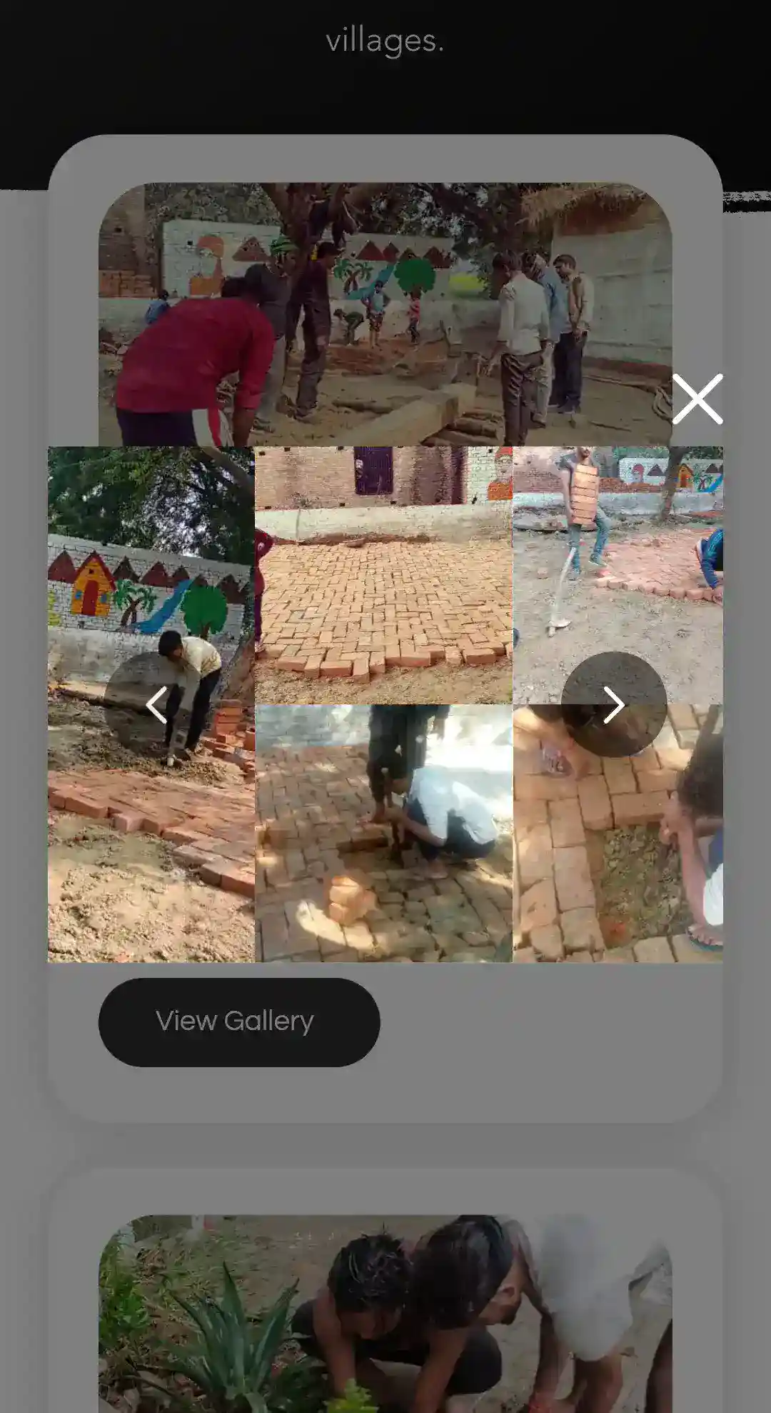
- 5/5 participants liked the activity page and the gallery feature of the site.
- 4/5 participants recalled the mission statements.
- A few quotes from the participants -
- "Are there no other options for donation?"
- "It's very easy to spot the information you need!"
Reflection & Next Steps
Thoughts & What I'd
Do Differently Next Time
It was a challenge to design this website as it was my first time doing it for an actual organization outside of my course projects. This experience fueled my passion for user advocacy and instilled the importance of design for social good — values I carry with me in every project I pursue.
- Continuous iteration creates truly impactful products: Sometimes, what you design can't be added exactly as it is in the development phase. The design might need to be re-adjusted at times and multiple design reviews during both design and implementation stages can help overcome these challenges.
- First end-to-end project experience and real-world client: I learned not just about designing for a non-profit, but also about collaboration, engaging in conversations to understand user requirements, and managing a site post-launch; all stages of a product's lifecycle.
- Style guides can save your life: While making adjustments to the designs during one of the many review phases, I once again realized the importance of maintaining a style guide; having it set up beforehand made the adjustments later on quick, easy, and saved tons of time.
- Test the Figma prototype instead of the Wix site first: I first designed in Figma, did design reviews, and then performed the actual testing in Wix. If I'd tested the Figma prototype beforehand, it could have saved time with fewer adjustments needed.